Visualize this!
Visualization of data is one of the hottest topics these days. No matter where I go, people are taking a huge interest in it. Infographics are floating the Internet, for example. Companies are looking to refine their dashboards with better visuals. This was also apparent at the Gartner BI Summit earlier this week.
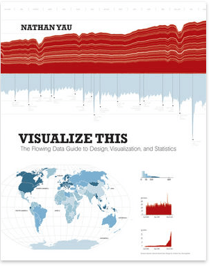
Despite the tremendous attention, there are only a few good books about this topic in the market. One of them is Nathan Yau’s title Visualize This: The FlowingData Guide to Design, Visualization, and Statistics. This week, I was able to finally read it all the way through. Did I enjoy reading it? Yes and no.
Great concepts
Yau does a fine job with engaging the reader in the first part of the book. He explains a number of important fundamentals of visualization. This includes a process that he suggests people should follow:
- Get your data
- Ask a question (what do you want to know about it?)
- Choose your visualization tools
- Explore the data (look for trends, patterns, differences, etc.)
- Tell the story and design the visual
There is a lot of relevant information for business analytics professionals in this section. I particularly like that Yau urges his readers to clearly figure out what story they want to tell by visualizing data. This is often forgotten in the design of a dashboard (e.g. do I use a line-chart to show the trend, or do I use a bar chart to show the variances?)
“Approach visualization as if you were telling a story. What kind of story are you trying to tell? Is it a report, or is it a novel? Do you want to convince people that action is necessary?” Nathan Yau
The other chapters
The remaining chapters of the book contain valuable content as well. The author covers topics such as handling data and picking tools for building charts. Several chapters are dedicated towards describing how to best visualize certain problems (e.g. patterns, proportions, spatial relationships, etc.). Each section provides plenty of examples and some good ideas. I enjoyed working through this. But I do have to say that the content isn’t nearly as deep as let’s say Stephen Few’s material.
A good book for BI professionals?
So far so good. There is just one thing that you should know: Many chapters are also full of technical instructions that teach you how to build graphs and charts in the open source package R along with Adobe Illustrator. There is a lot of code in the book. Technical folks might enjoy this. But it is not my cup of tea and most BI professionals will hopefully build their charts using the corporate BI platform. To be honest, I went ahead and skipped those pages.
Visualize this!
Nathan Yau’s book Visualize this! is definitely a good book. I learned a few things here and there and took ample notes. It is also entertaining. However, one has to understand that this is not necessarily a book dedicated towards BI professionals. Rather, this is a book for people who are looking to build infographics and other standalone visualizations. Nevertheless, you can tell that Nathan Yau is passionate about it and he inspired me to hone my skills. If you are looking for a deeper and more business oriented read, I would rather recommend the books by Stephen Few and Edward Tufte.


Comments
One response to “Visualize This! A book review”
I think design is definitely important when displaying data. The same aspects are used for graphic design. Colours are important to identify separate bits of data as they are used on websites to separate content.