Let me start by saying an obvious thing: Gauge charts do deserve some recognition. Actually, they deserve a medal – a medal for being the most controversial chart type in history.
When I first saw a gauge chart, I was impressed. They looked pretty cool. Things changed when I got involved with my first BI project. A closer look revealed that these charts are actually pretty tough to look at. But let’s back up and start from the beginning.
GAUGE CHART
Gauge charts allow us to visualize data in a way that resembles a real-life speedometer needle or a regular gauge. They usually display a single key measure. The outer scale of the gauge is often color-coded to provide additional performance context (green for good, red for bad). Below is a typical example:

THE PROBLEM
While gauge charts kind of look cool on the surface, they do exhibit a few problems when you look closely:
- They take up a lot of space. That is highly relevant for a dashboard where we are dealing with some space constraint.
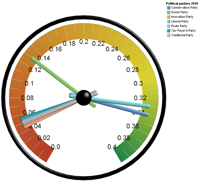
- They do not reveal a lot of information. The only thing we can learn from the five gauges above is that most plants are above plan. That’s it. We could have put that into a tiny table. Other valuable context such as history is not provided. We are basically not getting a lot of bang for the buck.
- They work best for single data points. Putting multiple needles into a gauge not only looks ugly, it also makes it extremely hard to read. Take a look at the example below. The gauge displays the election results for a few fictitious parties.

THE ALTERNATIVE
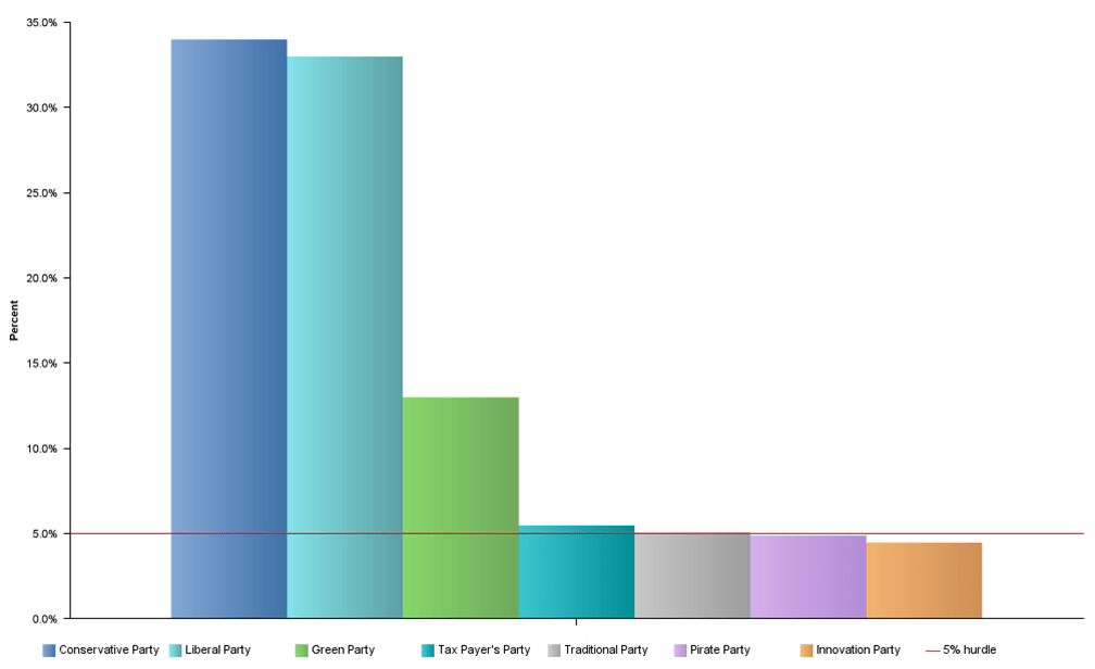
If gauges are not that great, what is the alternative? Well, there are a bunch of alternate charts that usually work much better. Let’s stick with the example above. We could simply put the data into a bar chart and indicate the hurdle percentage rate:

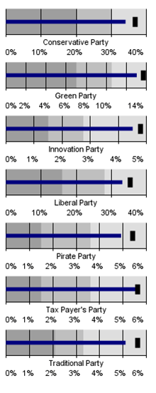
This version is a lot easier to read, isn’t it? Another option would be to use Stephen Few’s bullet charts (check out this post for a discussion of the bullet charts). We could stack them up like this:

This stack provides a lot more information than the original gauge: target for each party, shaded areas to rate the performance. Also, it is pretty easy to compare the different parties. We could further add some sparklines on the side to add historical context. Both alternatives take up less or slightly more space. They are more effective at providing information and they are easier to read.
BUT…..
Most people would agree that gauge charts are inferior to other chart types. But many executives and business users ask for them. What to do? Based on my experience, it is best to show alternatives and to educate. Charts like the bullets above are relatively new and we cannot expect users to adopt them outright. But it is worth the effort to instigate change. I have had a few situations where my team had to challenge requests for a Ferrari-like dashboards. It was hard work to educate and to gain acceptance for the alternatives. But I believe the executives are much happier with the non-gauge version.
THE GOOD NEWS

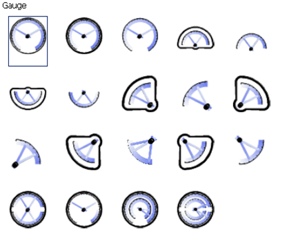
IBM Cognos 10 provides a very powerful charting engine. There are over 160 different chart types available. Gauge charts are obviously part of that. Finding an appropriate type should therefore not be too difficult.
Gauge charts are very polarizing. Some people love them, others hate them. I personally do not find them very effective. When it comes to designing a dashboard or a report, we should select the type of visualization that gets the job done. I therefore highly recommend looking at some alternatives. But we all have different tastes & preferences.

Comments
3 responses to “A few thoughts about gauge charts”
All data visualization is an excercise in education. For example, note that in the bullet chart the scale isn’t the same on every line. Sometimes it’s 6% other times, 40%. It’s an entire industry for a reason – flashy designs catch attention but only something very well thought out will convey an accurate story. The problem with tables is that the reader has to interpret all the data points himself; the problem with charts is it’s too easy to imply performance with the visualization itself and not just the data. In BI our challenge is to balace the pros and cons of all available charting tools. P.S. I, too, dislike the guage chart for the reasons you’ve stated.
Thanks for your thoughtful comment, Angela! You are right about the scale of the bullet charts. You definitely have to pay attention. But this actually highlights a big question: what is the main purpose of the visualization? In the case of the fictitious election results, I am most likely interested in the total results and how the parties stack up, i.e. the bar chart probably communicates this in the most effective way. However, if I am interested in plan vs actuals (say I am acting as a political analyst…) I would probably prefer the stack of bullets. The bullets provide a bigger focus on that rather than the absolute results. So many options….