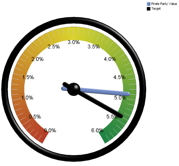
Executives often want to have a quick overview of some key metrics to find out what the state of their business is. Questions like: Are my margins on target? Is customer satisfaction within an acceptable range? What is the size of my pipeline? All this information is typically summarized in a dashboard. The easy thing is to simply put this into a table.  But tables are hard to read. And they take up a lot of space. The other popular option is to put the data into a gauge chart. But gauge charts take up a lot of space, too. And if we are honest with ourselves: they are really hard to read. Granted they look cool. But do they tell a story in an effective and efficient manner? Probably not.
A BULLET
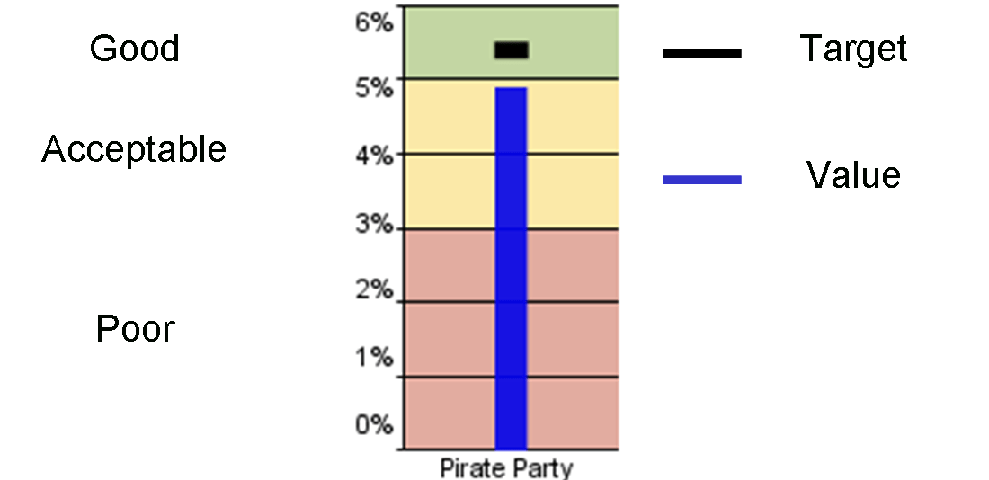
A few years ago, Stephen Few introduced a new chart that promises to fix the shortcomings of the above described approaches. It is very simple but powerful chart and it is called ‘Bullet Chart’. Cognos 10 allows us to leverage these charts. Below is an example:
 Let’s take a look. The above example shows the election results of a fictitious political party. The blue bar in the middle indicates the actual value (4.8%). The short black bullet towards the top indicates a target measure (e.g. budget, forecast, etc.). Color shades display ranges of performance (e.g. poor, acceptable, good). We can quickly see that the party missed the target but the result falls into the acceptable range. It is indeed a very simple chart that provides a lot of information in a concise manner: Target, Actual, Performance Rating. In Cognos 10, you have the ability to set five different performance zones in different shades or colors.
A STACK OF BULLETS
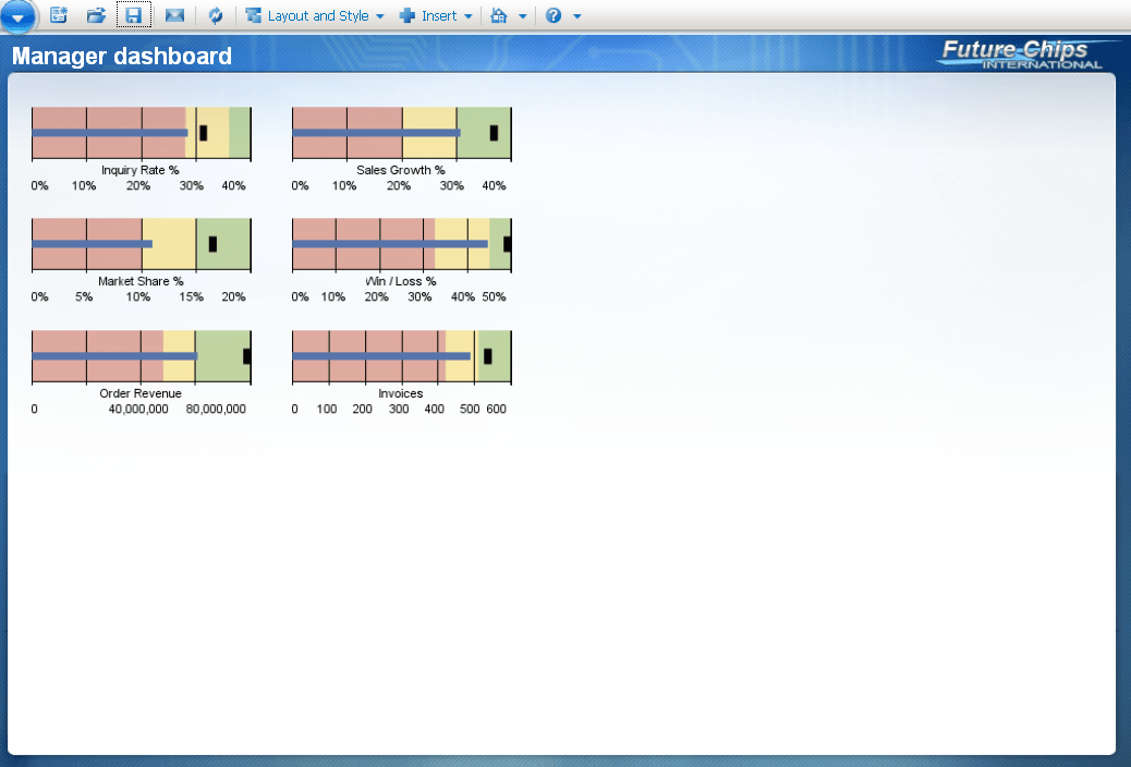
One the things I like about the bullet charts is the fact that you can easily stack them. That makes the bullet chart an ideal way of communicating multiple measures in a dashboard. It is easy to get a quick overview and the stack is very space efficient. In Cognos 10, we can have vertical or horizontal bullet charts.

CAUTION?
The are just two minor downsides that I see with the bullet charts. The chart in its pure form does not allow us to show the future trend or forecast. Also, it does not display history. It is a simple snapshot in time. But the last shortcoming can easily be mitigated by combining the bullet chart with a sparkline. (I will look at sparklines in the next post)
Toss those gauges! Take a look at the bullet charts next time you design a dashboard. But make sure to train your users. Despite its simplicity, I have seen some people struggle to understand this chart. We don’t want our users to bite another bullet, right?

Comments
6 responses to “Hands-up! Here comes a bullet chart”