Gauge charts
A few days ago, I had a discussion about gauge charts. A colleague and I had reviewed a collection of operational dashboards. Some of them contained large sets of gauge charts. Those dashboards were the most ineffective. At the risk of repeating myself, here are some thoughts about gauge charts.
- Gauge charts are not necessarily very effective at communicating information. Other chart types such as bar or bullet graphs are usually easier to read.
- Gauge charts waste a lot of space. Dashboards should not require a user to scroll through its content. That would require them to use more working memory than we have. We therefore need to utilize the limited space we have in the most effective manner. Given the fact the gauges are not superior to other charts, why waste so much space.
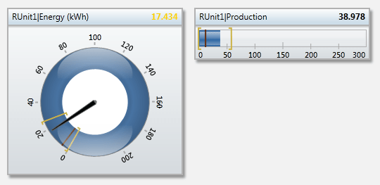
Take a look at this example. Three of those bar charts fit into the space that is occupied by the gauge. Is the gauge more effective than the bar? I don’t think so. (By the way, the yellow lines indicate the range of the value.)

Why then?
Most analytics professionals would probably agree with me that gauges are not that great. But why do we see them in so many dashboards then? I think the answer is pretty simple: People want to see them! The general level of knowledge about data visualization is still relatively low. Managers are therefore inclined to pick the chart types that look cool. Unfortunately, too many analytics professionals still shy away from pushing back on those requirements or they also lack knowledge. The lack of knowledge is also responsible that most software vendors feature gauges in their marketing materials (customers are asking for them).
Education
It’s up to us analytics professionals to educate business users about gauge charts. Let’s start that process today! Also, look at your dashboards. Where do you have the ability to clean them up?
