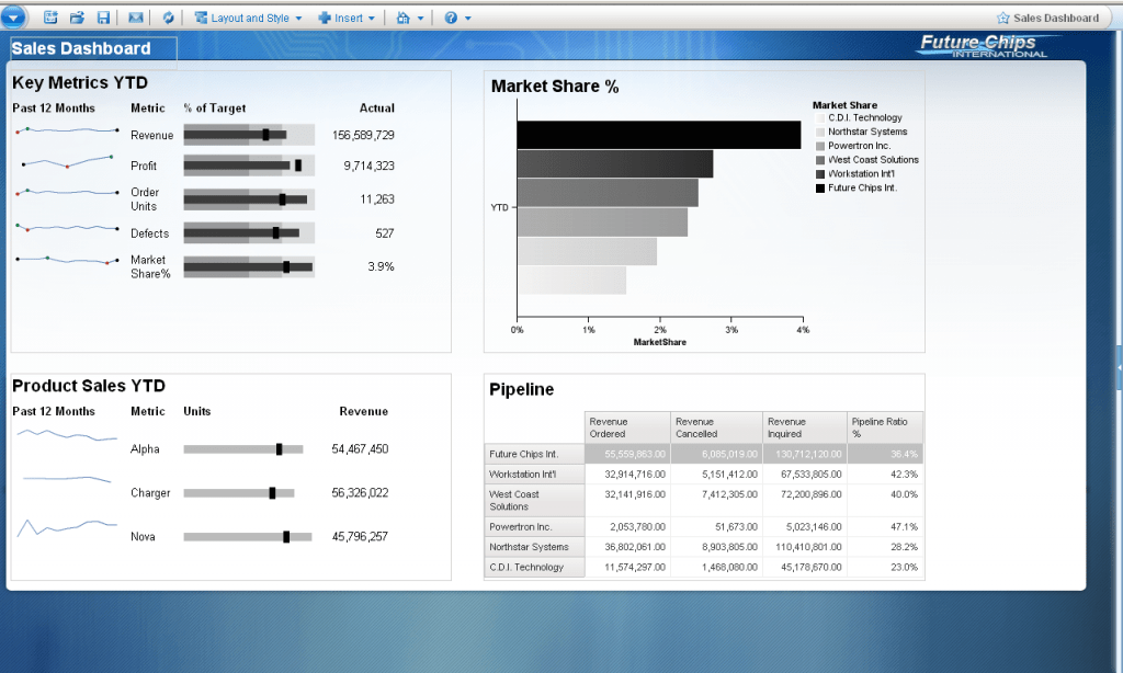
Cognos 10 offers a huge library of charts. Several new types were added in the last release. There are now over 160 different charts available. Amongst the new additions, you will also find Stephen Few’s bullet charts. They nicely complement the existing sparklines that were already available in version 8.4. Cognos 10 also provides new and enhanced color palettes that help design beautiful reporting objects. Overall, Cognos 10 offers some really cool options for building effective dashboards.
A SAMPLE DASHBOARD
My colleague and friend Paul sat down last week to quickly create a sample dashboard in Cognos 10 using the new stuff. He took the new charts and also applied one of the palettes. Take a look – I love it! It’s simple but very effective. As a sales executive, I will immediately obtain an overview of my business.
ACTIVE REPORT
Bullet charts and sparklines are also available for Active Reports. You can therefore build awesome looking dashboards for online and offline use. Even better: they also work with the new iPad app.
If you happen to attend BAForum in Las Vegas in a few weeks from now, make sure to look for some the sessions that discuss Cognos 10 and dashboarding techniques in detail.


Comments
2 responses to “A Cognos 10 Dashboard”
Informative as usual Chris.
Bullet Charts are definite added value for displaying tons of data in a very concise space. Really liked the sample dashboard as it showcases the power of IBM Cognos.
Thanks, David! Bullet charts are great. Unfortunately, not too many people know about them….yet.