A useful dashboard?
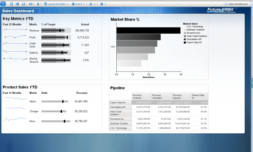
The other day, a former colleague sent me several screenshots of a ‘dashboarding solution’ a new team member had proposed to him. What I saw was wild: A set of complex, colorful and overloaded screens. Not just one screen, but a whole book of different pages. There were long tables mixed with colorful gauge charts. It took me a few minutes to understand what was happening. This was clearly not a dashboard but rather a poorly designed reporting application. A dashboard is meant to provide us with a quick overview of our most critical business information. It is not supposed to deliver us a 360 degree detailed view.
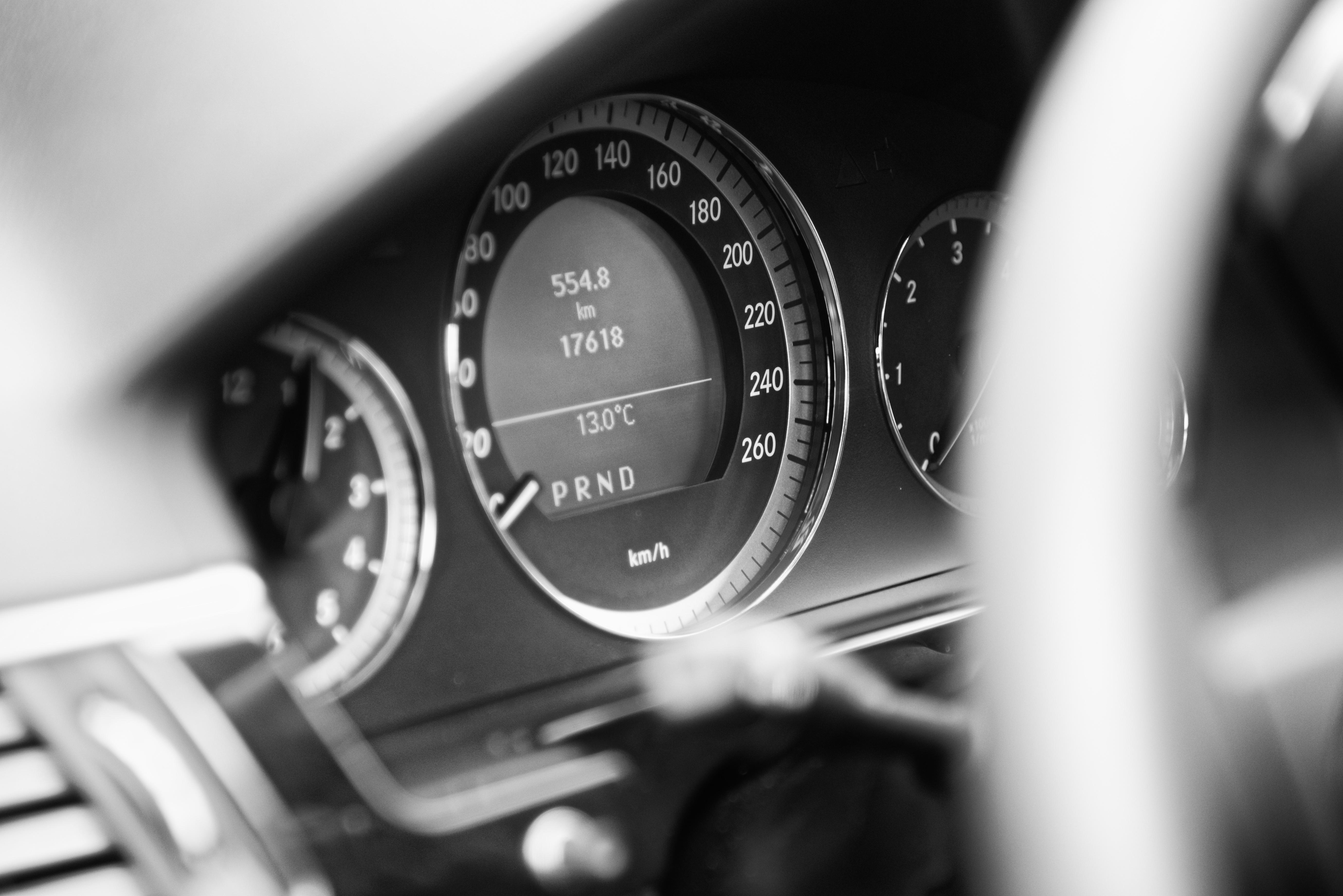
Unfortunately, too many dashboards are too complex these days. They fail to provide information at a glance. Overly complicated and saturated screens frustrate managers. To avoid project failure we should apply careful restraint during the dashboard design process. I have found that the dashboard in my car provides inspiration for that.
The car dashboard
Car dashboards are quite brilliant. They allow us to obtain critical information within a split of a second. How do they manage to do that? Here are some reasons why:
-
Simple – How long does it take to understand the dashboard of a new car? The answer is: It takes a few seconds. The car dashboards are deceptively simple. You don’t need the manual to understand how it works.
-
Compact – They are compact. There is a single screen. We don’t have to scroll through multiple screens to find out how fast we are going.
-
Uncluttered – Most car dashboards are super clean and uncluttered. Colors are carefully selected. There aren’t any logos. Every object has a clear purpose. It would be hard to take anything away.
-
Visual – Yes, they are visual. Visuals are easier to read than text. We do not find a table with our historical speed and RPM in the dashboard. Reading that would take too long and it would take the focus away from the road.
- Important– Only the most important information is displayed.Everything serves a clear and distinct purpose. It would be almost impossible to take anything away.
-
Exceptions – Identifying problems is really simple – a red icon will immediately alert us. We don’t have to go digging for that critical information.
-
Entry point – Modern cars allow us to drill-down whenever there is an exception. But that is truly optional. The dashboard simple acts as the entry point and not more than that.
Your management dashboards
Next time you design a performance dashboard, think about this list. A lot of those qualities should also apply to your reports. It is our job as business analytics professionals to make it easy for managers and knowledge workers to turn data into information. But to do that, we need to pay attention to the design process.


Comments
3 responses to “What my car taught me about designing a successful dashboard”
Car dashboards also combine multiple measurement protocols matched to the need. Certain things are continuously monitored and reported e.g. speed; certain are continuously monitored and only reported when a limit or tolerance is reached e.g. oil warning light; while other things are triggered by events e.g. the warning sound that goes off when you leave you lights on after witching the engine off. Dashboards also give great early alerts such as giving you plenty of notice when your fuel level is getting low allowing you time to act.
Thanks for your thoughtful comment, David! Spot on!!!
This is the best advice I’ve heard about BI dashboards in a long time. Yes there are some very clever and impressive insights available but dashboards are essentially for speed, glancing, keeping the machine on course. Deep dives are for another time, roles, reporting etc, but dashboards should be simple. User-acceptance goes up and the value they offer is realised.