Stacked Bar Charts
Part-to-whole analysis is a common task in business. Let’s say we want to analyze how much different product groups contribute towards total revenue. Or we want to analyze our cost across different cost element groups. One way to do this visually is to leverage waterfall or pareto charts. Another popular option is to use stacked bar charts. Stacked bar charts are just a special type of bar chart. Instead of spreading the different categories out across the x or y axis, we stack them. But are they really useful? I have mixed feelings about them.
Single Stacked Bar Charts
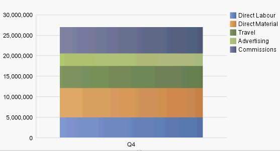
Below is an example of a stacked bar chart. This provides an overview of the cost structure for a certain fiscal quarter. You can see that each stack in the chart represents a specific cost element group. The entire stack indicates the total cost.
Is this a good chart? Sort of. Notice how much effort is involved in reading the graph. Comparing the individual stacks requires effort (look at Commissions and Travel, for example). I also find it hard to read the specific values of each stack (how much was spent on advertising?). On the positive side, this chart allows me to quickly identify the total cost. And I obtain a somewhat solid overview of how the money was spent. However, most business analytics platforms like Cognos 10 allow you to hover over a chart section to see the individual values. That makes the stacked bar chart above somewhat more useful.
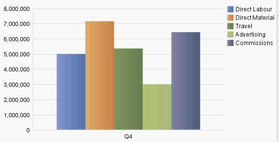
Another way to display this – and I prefer this option – is to use a regular bar chart. Take a look:
 Notice that the comparison of the different cost categories is a lot easier. You can quickly read the individual values and the comparison between the cost elements is easy as well. But I am missing the total of my cost. We would either have to calculate that or include the information in a different manner. The stacked bar chart therefore does not really impress me in this type of setting.
Multiple Instances
So, should we toss those stacked bar charts then? Not necessarily. Take a look the next example. The analysis is now extended to the entire fiscal year. There are multiple instances of the stacked bar chart.
Notice how different this looks. You can quickly see that total cost have increased in the last quarter (after decreasing slightly). I am also able to see how the different cost elements have changed throughout the fiscal year (look at advertising, for example). The stacked bar chart is now much more useful. I personally like this. But what about the traditional bar chart in this situation? Let’s take a look:
The graph invites you to compare the cost composition quarter by quarter. The comparison between different quarters is also not difficult. The only problem with this version is that the overall cost are difficult to assess. Both versions have their strengths and weaknesses.
Stacked Bar Charts – Summary
Stacked bar charts are certainly not bad. But as the examples above show, they are stronger in a multi-instance setting. But even then, you need to be careful: stacked bar graphs tend to look strange when you have negative values (give it a try!). The single stack is not that strong as compared to the traditional bar chart. Both offer different insights. And let’s not forget about waterfall and pareto charts as well.
From an analysis point of view, I would probably want to switch between the different charts. IBM Cognos 10 provide users with the ability to change chart types on the fly. That makes the analysis of data very interactive.
Have you added stacked bar charts to your toolbox? If yes, make sure to use them in the right circumstances.
P.S.: I will take a look at stacked area charts in February.


Comments
2 responses to “Stacked bar charts? Mixed feelings!”
I always liked Stacked charts to show proportional change over time i.e Stack is 100% and by having them buy months etc. you can easily see the relative change of stacked items.
Hi Juha – I fully agree! There is an issue when you have negative values, though.