Waterfall Charts?
Do you like pies? I do! But not for analyzing data. Pie charts are just too busy and too hard to read in most situations. Yet they are the frequent tool of choice for visualizing the composition of a certain variable. Take a look at this example: I want to find out how total revenue is split between different product categories. The easy choice would be to create the following chart:

Personally, I don’t like this! You constantly jump around the different pieces and it is really tough to obtain the overview that we are looking for. Pie charts work for few variables that account for larger pie slices. Another and better option is to use a bar chart. To make it easy for the viewer, I ranked the values in IBM Cognos 10:
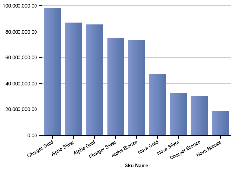
Isn’t this much better? You can quickly identify the best performing products. It is easy to read the individual contribution of each product. But I am not able to see my total revenue amount. Good news – there are different ways to perform this type of part-to-whole analysis
CHASING WATERFALLS
Waterfall charts (sometimes called Progressive Charts) allow us to visualize the composition of the a value along different segments. In plain English: Total revenue can be visualized as a build up of the different individual values of the products. Take a look at the example below. The values are once again ranked:
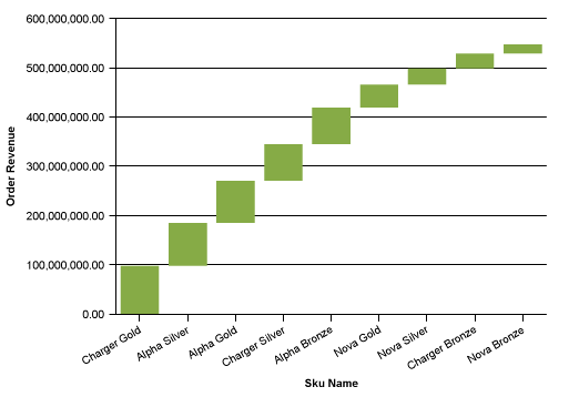
Notice how quickly you can see the segment revenue along with the total revenue of roughly 540 million. I personally like the clean and uncluttered look. Reading the individual values is a bit harder than in the traditional bar chart. But IBM Cognos 10 allows me to hover over each segment to obtain the actual value. It’s personal taste which chart is more effective. Here you can see both versions side-by-side.
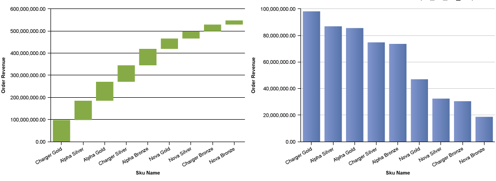
Waterfall charts are great for any kind of part-to-whole analysis: revenue/ margin across products, customers, channels. Composition of Profit across the P&L, etc.. There are a few interesting examples on Wikipedia.
THE PARETO CHART
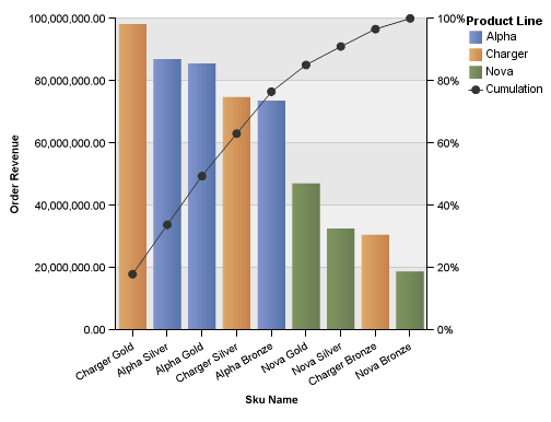
There is yet another great option for displaying this type of data: Pareto Charts. They are are named after the Vilfredo Pareto who proposed the 80/20 principle. This chart simply enriches the bar chart we saw earlier with a cumulative percentage line. Take a look:
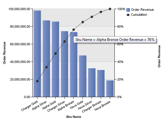
This graph allows us to quickly answer questions such as: Which products create 80% of my total revenue? (roughly everything up to Alpha Bronze). In other words: the pareto chart allows me to identify the most important items. IBM Cognos 10 allows different customization options which I would highly recommend looking at. Hiding one of the axis is not a bad idea, for example. The use of colors could be helpful here to identify the main product categories:
Waterfall Chart vs Pareto Graph?
Seems like a lot of options, right? Which one is the best? Can’t say. It really depends on the situation. I like all of them. There are slight differences and it depends on the user. Waterfall charts are probably better suited for executive dashboards. Pareto charts are more likely useful for analytical purposes. And the classic bar chart is always is a winner. Try to add these charts to your tool-box! And drop those pies.

Comments
3 responses to “Waterfall charts, pareto analysis and beyond”
I still like pies for comparing 2 (and only 2) categories. It’s the best representation for this IMO. Waterfalls are great – I find many users like them paired with a crosstab to see precise numbers (think rebate analysis in retail).
This is good stuff, as usual 🙂
Thanks, Jonathan! Agree. Pies are good for small data sets.
Great read and definitely beneficial to all excel users.
Try out this free waterfall chart creator if you in a rush at
http://www.excelwithcharts.com/topic7.html
Hope that helps.