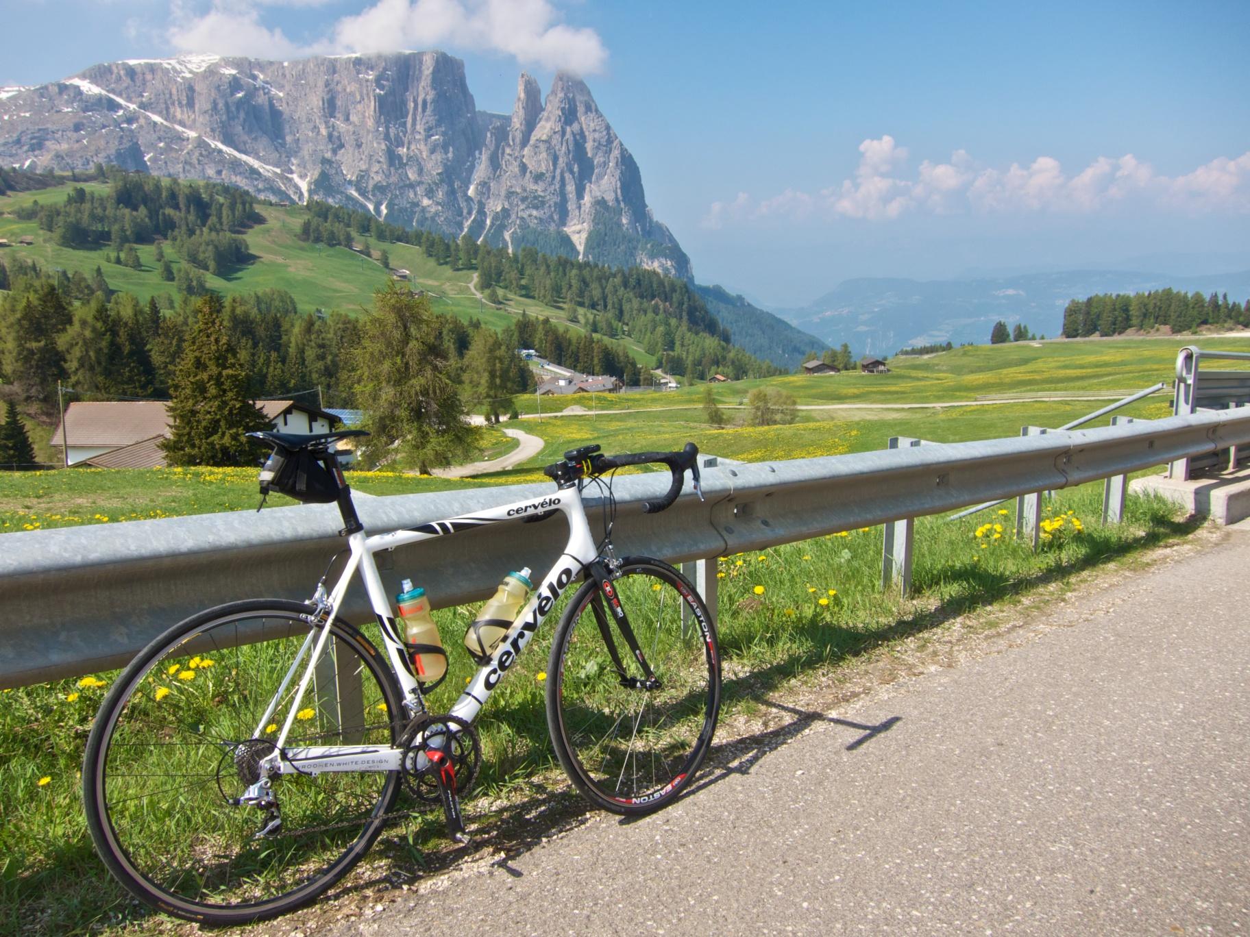
A few months ago, I posted an article about analytics in cycling. This post still remains one of the most popular posts on my blog. Thanks for all the great comments, feedback and questions. Many of you wanted to find out more. Here is a quick report of how technology helps improve cycling performance. On Saturday, I had the opportunity to ride the famous Alpe di Siusi climb in the Dolomites. It is a super nice and friendly climb: breathtaking landscape and not too long. It is fairly steep (average of 8.5%) but it is steady. In other words: a perfect opportunity to fit a short but challenging ride into a constrained schedule.
GADGET ALERT
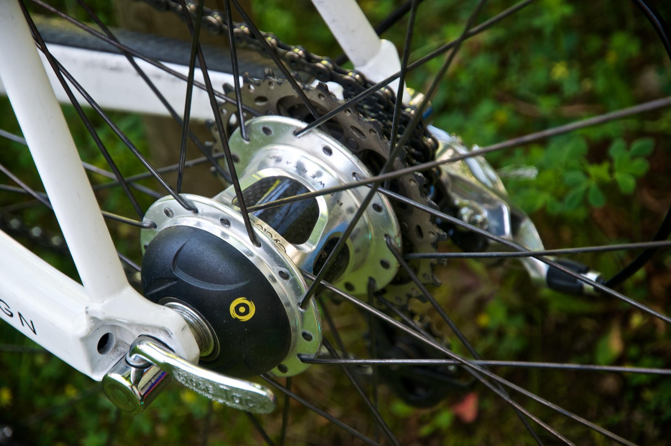
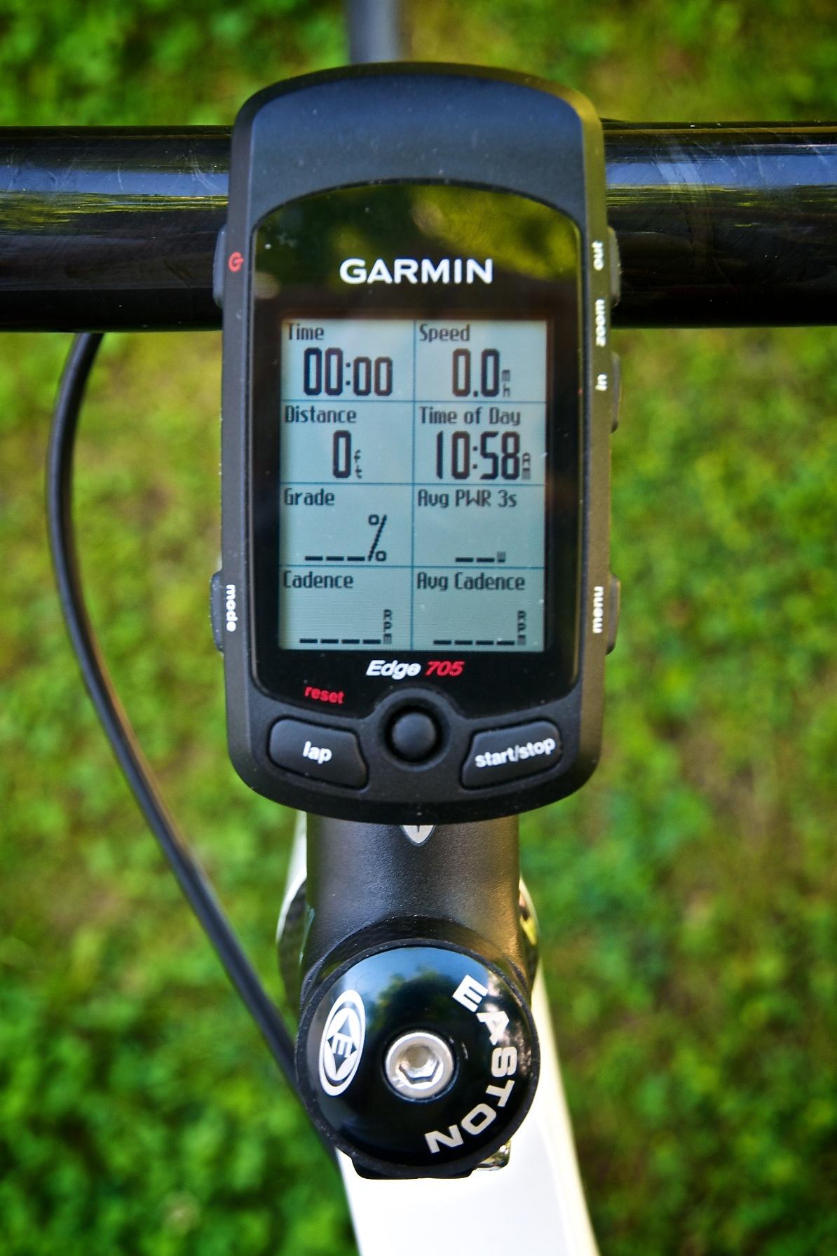
A few years ago, powermeters became an affordable training tool for amateur riders like me. Smart technology is packed into either the bike cranks or the hub of a cycle and it measures a lot of data: power output, cadence, speed, torque, etc.. The data is sent to my Garmin Edge 705 cycling computer via ANT+ (similar to bluetooth) where it is combined with further GPS and altitude data. Following each ride, I download the data into a smart software called WKO+. This is where I can analyze each ride and learn a ton of stuff about myself.
PREPARATION
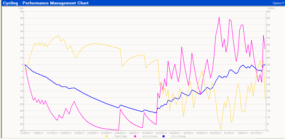
Before leaving the house, I checked my performance chart in WKO+. This chart literally calculates and predicts my fitness using smart algorithms. The blue line for example shows my fitness ramp up. You can see that I had a rough spring: I was injured and could do not much until March. The yellow line indicates my ‘freshness’: a value below zero indicates that my legs are likely to feel heavy. A positive value indicates that I should have fresh legs. These algorithms work amazingly well and it really helps me put a solid training schedule together. For Saturday, I can see that I should have somewhat fresh legs (value is around +8). Perfect timing!
ON THE BIKE
The climb went pretty well. Recent tests in training sessions have shown me that I am starting to get back in shape: I can easily sustain around 260w for about an hour. Wattage higher than 280 is likely to cause me some trouble (I experienced light cramps in a training session a few weeks ago). That information helps me with pacing. The climbs in Italy are pretty steep and it is easy to get carried away and push too hard. But after a few minutes I realized that the recent training efforts have indeed helped me improve and so I settled into a higher than normal pace. And this strategy worked out pretty well: I felt great and strong throughout the entire climb. I did have to hold back a little as it was getting extremely hot and I still had another climb across Passo Pinei.
OFF THE BIKE
Back home in Munich, I downloaded the ride into the software. How did I do? First, I take a look at my power distribution. A quick report shows me how much time I spent in different calculated training zones. The two zones on the right are the ones that really, really hurt. This is where your legs & lungs are screaming in pain. Hmm…Looks like I had a good day based on that. It seems that I have made some good progress. Time to increase the overall training intensity?

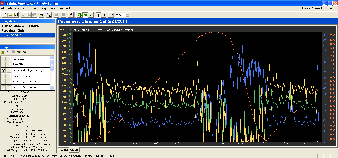
Let’s take a look at the detailed ride. The orange line shows the altitude profile. You can see that there were two different climbs. The other curves show the important stuff: power output (yellow), pedal cadence (green), speed (blue). Looks wild, doesn’t it?
But I am interested in my climbing performance. So let me zoom in on the Alpe di Siusi climb. To make it easier to analyze the data, I am drawing a few lines in here: the yellow dotted line shows my current threshold power (the power that I can produce for about one hour without falling off my bike in exhaustion) along with my favorite cadence zone (anything below 60 rpms does not feel good…). Aha. Looks like I had a good ride. Training is paying off indeed. I consistently rode above my estimated threshold and even had lot’s of energy to spare at the end of the climb (look at the yellow peak). Awesome.
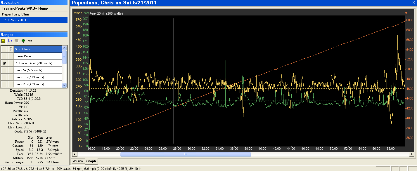
The software also calculates several important and helpful KPIs. I won’t go into the details, but these KPIs help me further manage my training schedule. One easy example is Kilojoules: I created energy worth 732 KJs (the equivalent of two Snickers!). That information is really helpful on longer training rides: it helps you manage food intake.
Perfect. Despite not having much time, I managed to get a solid ride in. The powermeter helped me pace and push myself. The post-ride analysis showed that I need to adjust my training schedule: time for higher intensity workouts. Also, I will have more time to ride in the Alps over the next few weeks and will use this knowledge to ride some of the longer and harder passes.
It’s fun to ride this way: The analytics have allowed me to learn a lot about myself. I ride more consistently now. And I perform much better on climbs. It feels awesome when you have some energy left in the tank at the end of a climb: this time I raced a local delivery truck. Italians love cycling and the two guys in the car cheered me on while pushing the gas pedal a bit more. The sun was shining, the clouds opened up on amazing view and I felt like I could fly right in that moment.


Comments
2 responses to “The analytics of cycling”