Excuse me?
We often talk about how to best visualize data so that the audience can quickly discover the most important information in often complex data sets. But we cannot forget that it is also possible to achieve exactly the opposite effect: You can also leverage visualizations to distract and confuse people. As a matter of fact, it is possible to create visuals that completely hide important messages. Why would you do that? I guess if you want to hide bad news….right?
A bad example
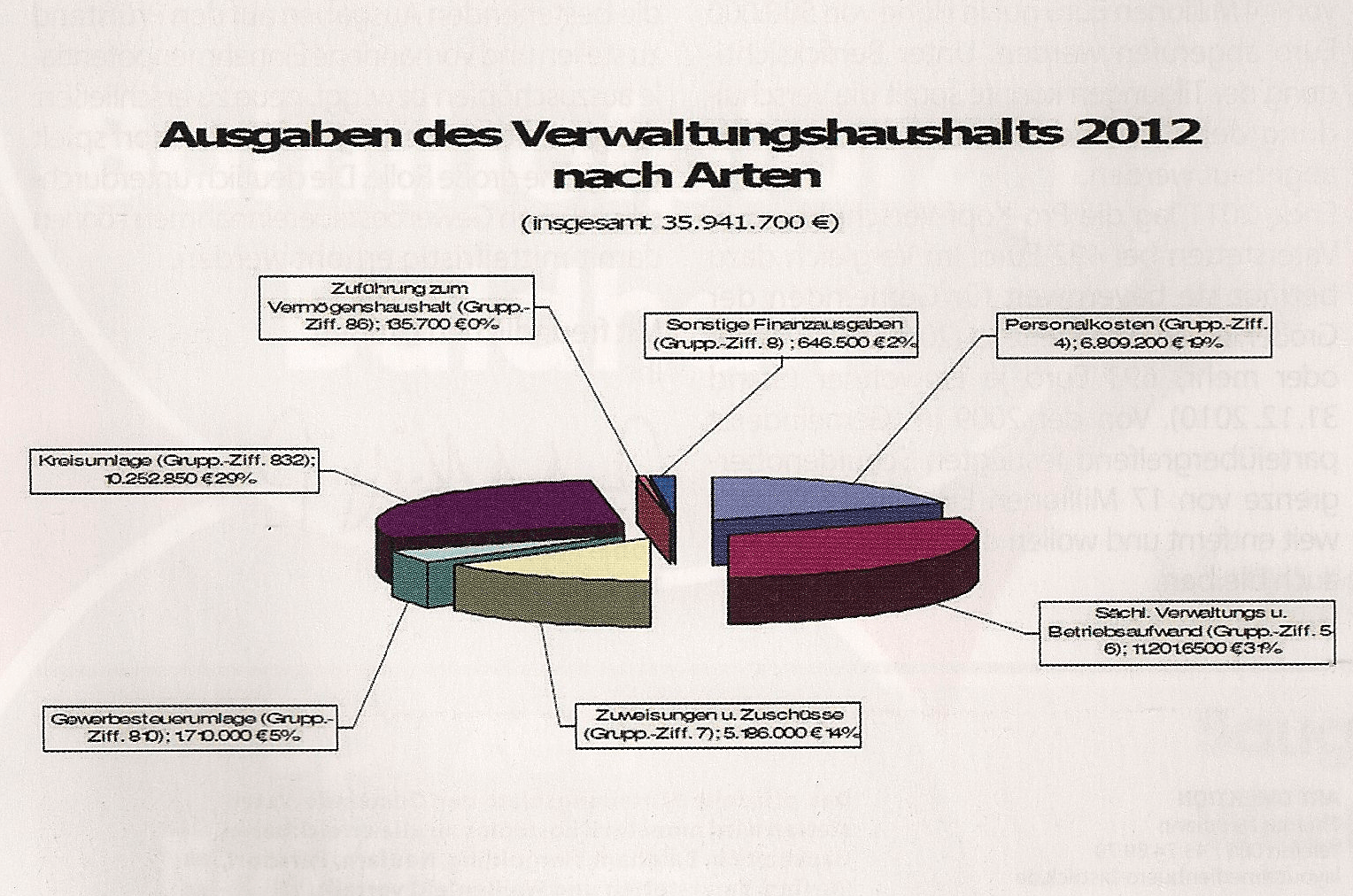
The other day I received the 2011 spending report of the town that I live in. The text was quite dense and it included a ton of public sector terms that I did not understand. The core of the report, however, was centered around a graphic that outlines the detailed spending. Without further due, here it is.
What’s wrong with this chart? Boy….pretty much everything: Extreme 3D, poor font choice (I can’t read it…), technical language and the colors… The sum of the parts is also not correct (as compared to the narrative). Percentages are not correct either (poor rounding practices). To be honest with you – when I saw this report I immediately got the impression that our town hall is trying to hide something. After some analysis I am still confused and not quite sure what to think about this.
To be fair, I believe that our mayor and his team are highly qualified. His approval ratings are extremely high for good reason. But this sort of communication does leave a bad taste in my mouth. It just makes you wonder….
A better approach
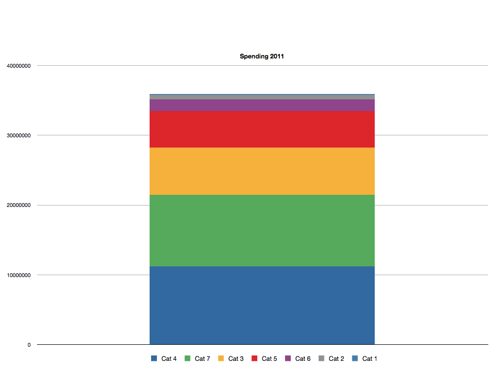
3D pie charts are never a good choice. The data above is quite simple and one could either leverage a standard sorted bar graph, a stacked bar chart or a waterfall graph. Really depends on your own personal preference. Here is an example:


Comments
6 responses to “How to confuse and distract your audience with poor visualizations”
Since it is difficult to compare lengths that don’t have a common baseline, I would prefer a standard bar chart. A simple bar chart would also eliminate the need for a legend so it would avoid the need to go back and forth from the stacked bars to the legend. A third advantage of a simple bar chart is that it eliminates the need for colors. Using http://www.vischeck.com to simulate how your chart would appear to someone with color vision deficiencies shows that it would be difficult to distinguish some of your colors.
Stacked bar doesn’t solve the problem. Cat 4 and Cat 7 (what are these?) are hard to compare. What adds to this is the contrast of the shades of blue and green used (use washed out / pastel colors).
Agree with Naomi that the old good bar chart (the horizontal one) is best for this particular purpose as it accommodates possibly long descriptions of the bars. AND, when suggesting the alternative, always use the original values plus the data point descriptions, heading etc then one can evaluate better if it is a valid alternative or just a partial facelift.
And when it comes to usability of this website a) comment body text font size is too small; b) considering the overall formatting, the font sizes on the proposed alternative should be larger.
Naomi – Love that site! Highly useful. I will certainly promote that in my seminars moving forward.
As mentioned in the post, there are various alternatives. The featured stacked bar chart is one option. The advantage of the stacked chart is that you can identify the total as well.
In terms of colors – looks like the vote is that Apple’s color schemes are not that great. I created this chart on a trip using Numbers for the iPad.
Alan – The numbers match 100%. Yeah, you are the first one who points this out really. Disqus works quite well when it comes to managing comments. But there are drawbacks to most tools.
Stephen Few has good analysis and suggestions on colors. Google with
site:perceptualedge.com colors inurl:pdf
Naomi is right to the point out that visualizations have to address also people with color vision disorders as the amount of these people remarkable. For overview see
http://en.wikipedia.org/wiki/Color_Blindness#Epidemiology
As to Disqus comments, ask your webmaster to change the following disqus stylesheet setting
#dsq-content #dsq-comments .dsq-comment-message { font-size: 16px; } – the 16px being your font size of choice
The grip provided by a tire is linked to the coefficient of friction (Cf) of the rubber compound and to the tire’s construction Radial/bias. This coefficient indicates the lateral grip the tire is capable of providing for a given weight being placed on it.