The other day, I made a bold statement about presentations: many of them suck and they especially suck when it comes to presenting data. Real meaning is often hidden in complex and dense charts. The problem is sometimes amplified by poor communication skills.
PRESENTATIONS ARE DIFFERENT
There is a fundamental difference between sitting in your office analyzing data and sitting in a meeting listening to a presentation. The second setting requires a lot of focus. Listening can be really hard at times and it is easy to loose track when we drop our attention for a few seconds. And there is no rewind button. Every time a new slide comes up our attention shifts to that slide. Our brain tries to make sense of it. Following the speaker during that brief moment is tough. The more complex a slide the longer this moment lasts and the higher the probability that the audience gets lost. To ensure that our messages are understood, we have to be thoughtful about how we present our data. Here are a few ideas that you can use to make your data sing:
1. VISUALIZE
One of the basic things I recommend is to utilize charts for presentation slides whenever we can. Reviewing raw data in a presentation setting is extremely difficult. We should not have to stare at a projector screen to make sense of data. It takes away too much focus.
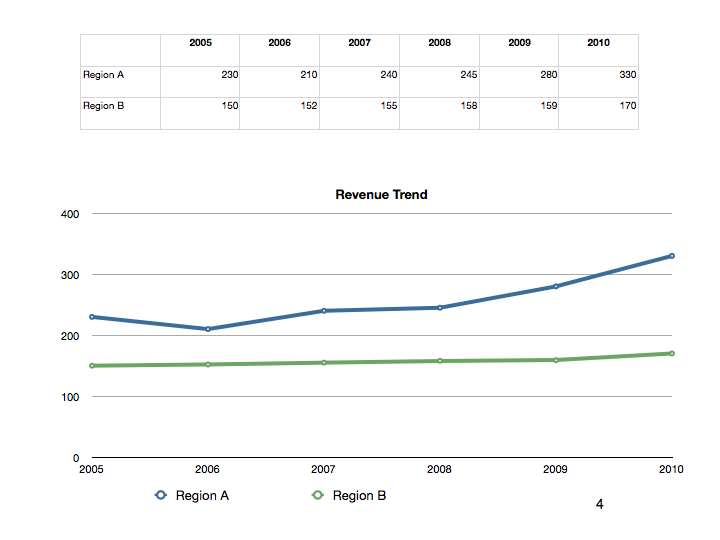
Sure, there might be cases when people need to see that raw data but we can always share printed documents as backup materials if necessary. Make it simple for your listeners and visualize the data. Look at the two contrasting examples below: it takes a while to consume the table, but the line chart immediately makes sense. Even on first sight.
2. CHART TYPES
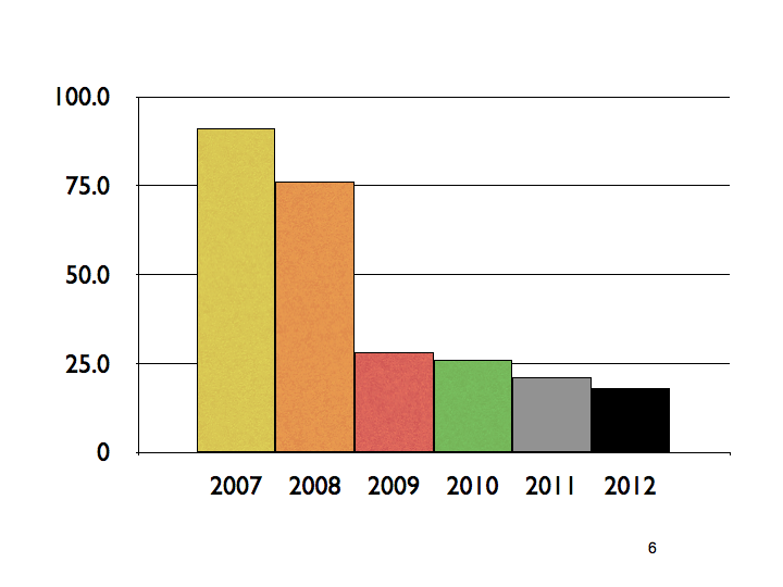
Make sure to carefully select your charts, though. Not every visualization lends itself to delivering a crisp message. Once again, the things that may work for us at our desk do not necessarily have to work when we follow a presentation. The rule of thumb is to choose the chart that can most easily be understood. That might sometimes require us to drop some information. Once again: we can always supplement our slide show with backup materials. If you have difficulties selecting the right type, take a look at some advice on this site.

3. SIMPLIFY
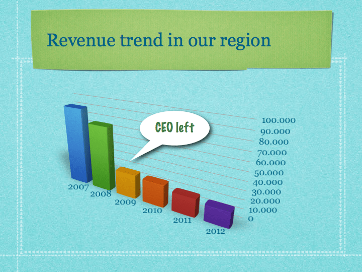
But even charts can either be too complex or we load them up with too much noise: 3D, logos, gridlines, pictures and unwise choice of colors. As a result, viewers and listeners have a hard time understanding. Presentation guru and author Garr Reynolds calls for a maximization of the signal to noise ratio: eleminate everything that could stand in the way (noise) of delivering our message (signal). Take a look at the example below. There is too much going on and our eyes tend to jump around.
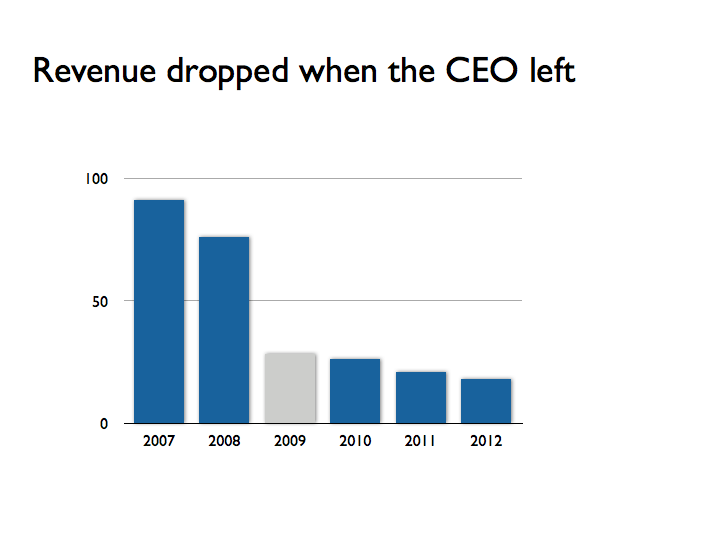
Let’s reduce the noise and focus on the just the signal (below). Isn’t this much better?
4. MAKE IT EASY
We should eliminate everything that stands in the way of being understood by the audience. In other words, we should make it as easy as possible for them to quickly catch the important items. We can do this by amplifying the signal. Take a look at the slide above: the headline features the key message. Also, note how the 2009 bar in the prior chart immediately pops out: This must be the year our CEO left! I can see it immediately. A simple but effective trick.
5. CREATE FOCUS
Too many slides are way too busy and people easily loose attention. My basic rule is that we should only deliver one message per slide. Don’t try to cram everything into a single slide. Remember: slides are cheap! Nobody is forcing you to deliver your message in less than ten slides. It’s up to you to decide. Allow the audience to absorb the information and then move on with your story. A simple and single message on each slide ensures that the attention is quickly refocused on you – the presenter.
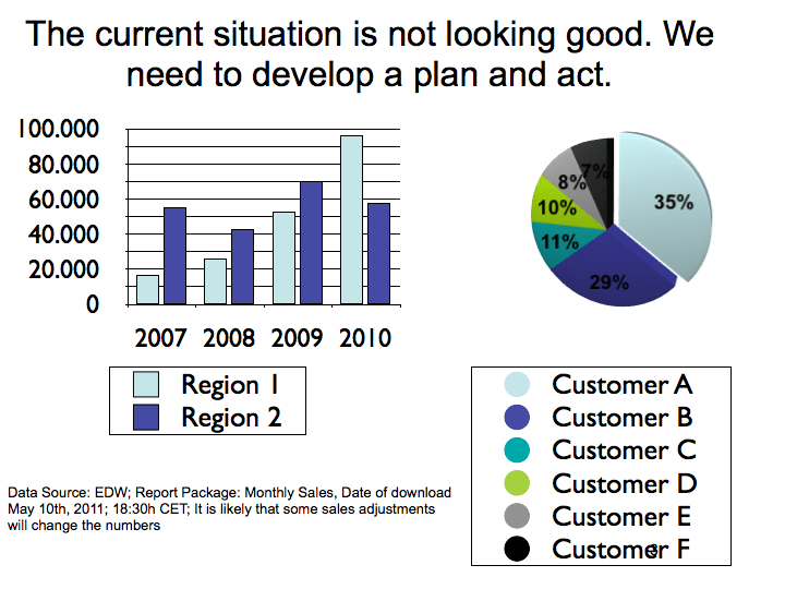
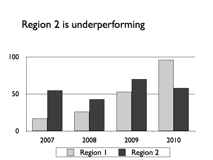
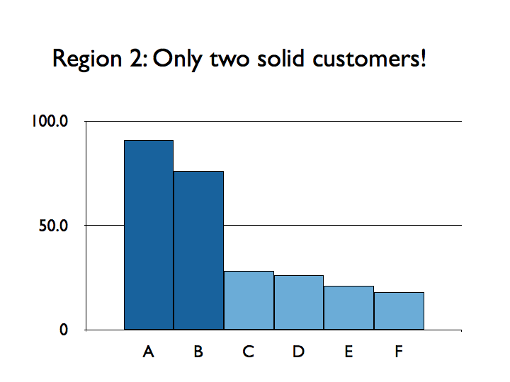
The slide above is way too busy. We jump around and try to figure things out. But let’s apply the rules and also create focus on a single message that we will spread across two slides:
NEXT STEPS
Try to incorporate these tips into your next presentation. They will make a big difference. And it does not have to be complicated. Applying these things will help you make meetings more effective. And by doing that you can make a big contribution towards making sure that the investment in Business Analytics does not go down the drain when we put our information on slides. We owe it to ourselves and to our colleagues.
[twitter-follow screen_name=’cpapenfuss’ show_count=’yes’]
