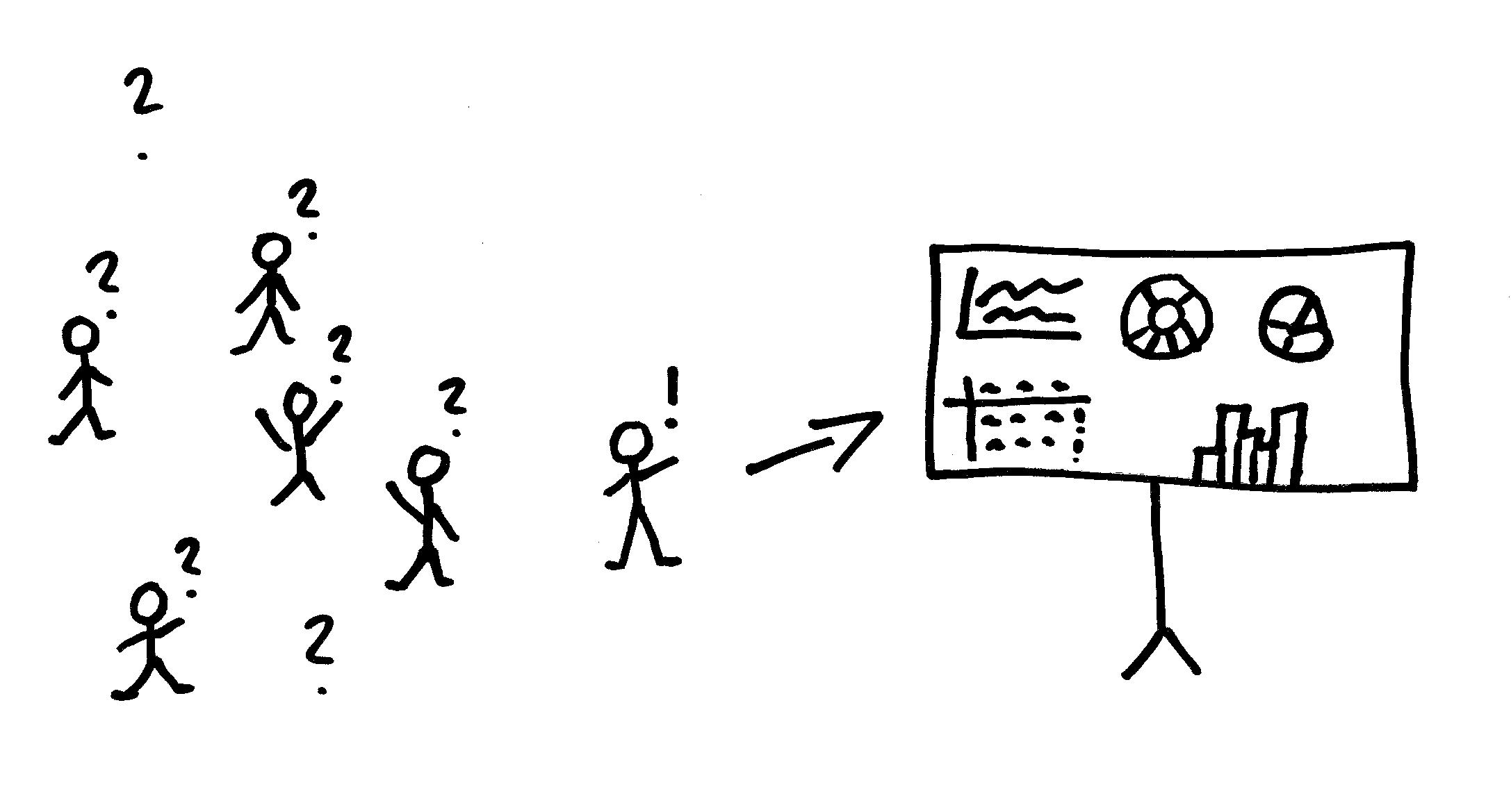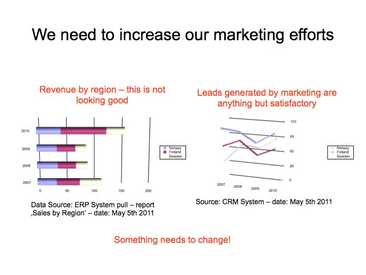
Let me be blunt and honest: Too many presentations and their accompanying slide decks absolutely suck. And they especially suck when it comes to displaying and discussing data. Over the past few years, I have sat through days- worth of boring and utterly useless presentations. Such a waste! And there was so much potential: great data points and valuable information. But all this was well hidden behind complex and confusing charts. And believe it or not: that is a problem for business analytics.
THE PRESENTATION PARADOX
We spend so much time and money on implementing business analytics software. We create so many awesome reports and dashboards. There is so much potential. But way too many people take this valuable information and literally destroy it by using the trusted information to create useless and complex slides. Those slides are then presented in meetings where we try to sell ideas and we where try to make collective decisions. But due to the convoluted slides (often coupled with poor communication skills) most messages fall flat on their face. I am tempted to say that the ‘last mile’ of business analytics is broken in these cases. It’s about time to fix that.
A CRITICAL SKILL

Famous statistician and popular data guru Hans Rosling famously discussed this issue and compared the presentation of data to playing music: “…few people will appreciate the music if I just show them the notes. Most of us need to listen to the music to understand how beautiful it is. But often that’s how we present statistics: we just show the notes, we don’t play the music.” It is not enough to create a sophistcated data warehouse and some shiny reports. No, we need to make the data sing when we present it to other people an especially larger audiences. Developing solid presentation skills should therefore be high up on the priority list for anybody who works in the area of business analytics.
COMMUNICATION
There is a big difference between presenting insights to an audience (meetings, events, etc.) and analyzing data at our desks. Following a presentation requires a different level of energy and focus: it is a lot harder to follow in many cases. Our brain tries to juggle processing the information on the slides while listening to the speaker. We therefore need to make it easy for our audiences to receive the messages that we have found and prepared. The reports and charts that work at our desks do not necessarily work in a meeting room. We have to think differently. And that’s the disconnect we often see and that Hans Rosling aludes to: we do not think differently and simply show confusing details when we should be showing a clear story. We are short-selling our efforts and the impact of our insights in effect.
But there is good news. Learning how to present and how to tell an inspiring story using data in a presentation does not have to be complicated. In a few days from now I will share some tips & tricks that you can put to immediate use. Start thinking about those presentations! As always, I am curious to find out what your experiences with this are.

Comments
6 responses to “Data + Powerpoint = Wasted Time?”