Dashboarding….Part 2.
Yes, we do know that we shouldn’t eat those chips. Yes, we do know that we should read more books. Yes, we know that we shouldn’t drink that much coffee. But…..BUT…..We all know that there are small things we can do that could really have a big impact on our life or job. But we still don’t do these extra little things but they take time and effort. We are all guilty of that. I am for sure. Most of us can tell some stories about that.
CRITICAL SKILLS
About a year ago I had a revelation. Together with two hundred other business and IT people, I was listening to a presentation about common data visualization mistakes. YAWN…. How exciting. A few minutes into the presentation it dawned on me. I actually didn’t know all that much about proper charting techniques. I had never actually paid much attention to it. By looking at the reaction of the other attendees around me, I noticed that they were in the same boat. How can that be? We are all professionals that are dealing with data on a daily basis. Yet, so many of us have never paid much attention to proper visualization techniques.
THE MAGIC PIE

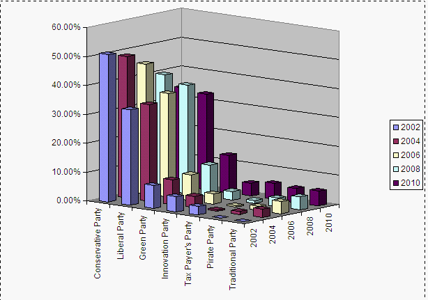
That day I decided to make a change. I felt a pressing need to learn more about charting techniques. And when you look around you can easily see that many of us need to make this change as well: We use ugly pie charts left and right, we create meaningless 3D visualizations and we connect data points that should not be connected. And that is not too surprising. Nobody ever really taught us how to properly visualize data and when to leverage which type of chart. To make things worse, nobody ever questions this. Executives seem happy with their colorful 3D charts. I will never forget the day when my then-boss at a traditional German company almost fell off his chair when saw a ‘cool’ 3D diagram I had produced with Lotus 1-2-3. But at the end of the day, many charts do a very poor job at telling a good story about the data.
DATA IS THE NEW OIL
Data volumes grow. The speed and volatility of business are increasing. As a result, we all need to make sure that we find meaningful trends and insights in our growing pool of data. There is a lot of insight to be unlocked. Many people are therefore saying that ‘data is the new oil’. But in order to really get the best out of our data we need to learn how to visualize it properly.
THE POWER OF VISUALIZATION
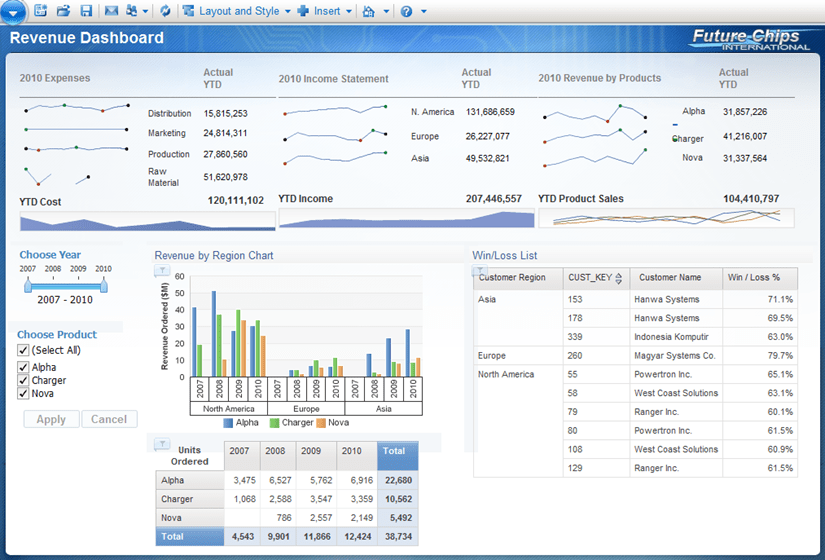
As John Medina points out in his bestselling book ‘Brain Rules’: “Vision trumps all other senses.” The nerve pathways of our eyes to brain are extremely powerful. John Medina continuous by saying that “Professionals everywhere need to know about the incredible inefficiency of text-based information and the incredible effects of images”. In other words: dry tables of numbers just don’t cut it. A picture says more than a thousand words. Let’s create charts that tell a powerful story. And those charts are especially useful when we utilize them in dashboards. Dashboards should be visual to allow users to quickly absorb and digest critical information.
CHANGE

We should therefore all take the time to learn more about charting techniques. And it’s a simple thing to do. Pick up a copy of one of Stephen Few’s books (see below for a list of recommended reading). Roam around the website of visualization artist David McCandless (I wrote about him a while ago). Play with your current numeric reports and put them into charts. Compare the different stories. Over the next few weeks, I will write some posts about some of the powerful charting options in IBM Cognos 10. IBM Cognos 10 comes with almost 160 different chart types. There are some fantastic tools in there that can really make your data fly. Make sure to follow along to get some tips and tricks.
Recommended reading:
- Stephen Few, Now you see it
- Stephen few, Show me the numbers
- Edward Tufte, The Visual Display of Quantitative Information
- David McCandless, Information is Beautiful

Comments
2 responses to “Charts? Yes, I know….”
Pretty much all of Stephen Few’s books are worth reading. I personally found Information Dashboard Design to be very useful. He also has a number of articles which are freely available on his website
I’d also strongly recommend reading through Graphic Presentation by Willard Brinton. Some of the chart examples go against what’s advocated by Tufte and Few (pie charts, lots of chartjunk) but it still gives quite a few excellent tips. There’s even a section that describes best practices in printing and binding (though it may be a bit outdated, the book was published in 1939).
Thanks for sharing, Paul!!!