Photography and dashboards? Huh? Fire and Ice?
Photography is a big and important hobby of mine. And it is a tough hobby. There is a lot to learn and the opportunity to make mistakes (read: create photographs that really suck) is huge. It starts with understanding your camera, deciphering basics like Aperture, Shutter Speed and ISO. But the hardest thing for me is photographic composition. Composition focuses on how we design a photograph. Over the past few years, I have studied many master photographers and read a bunch of books trying to educate myself and to improve my pictures (a tough mission as my artistic brain is completely underdeveloped). A few weeks ago, I realized that photographic composition can teach us a few things about Dashboard design. Dashboards should be highly visual after all and they need to convey information in a short-period of time.
- Less is more: Many successful pictures have been reduced to a bare minimum. Each element in the frame has a distinct purpose. You will hardly ever find a great photograph which contains empty coke bottles lying around for no purpose. It would create a distraction. By reducing the elements in the frame a photographer creates focus. The same is true for dashboards. We have so much information available. People therefore try to cram as much into a dashboard as they can. And we stick logos, banners etc in there along with messy charts and reports. But less is more. If we reduce the building blocks to a minimum, we can help managers focus on the important things.
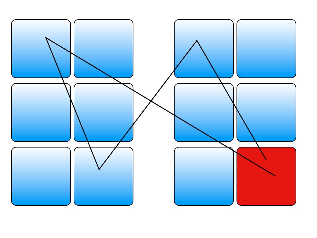
- Arrange carefully: Successful photographs are able to convey a certain message. The message is crafted by arranging the elements in the frame in a certain way. In other words: we can’t just find a nice scene or object but we need to carefully consider where to place items. The same applies to dashboards. Stephen Few for example points out that we should place the most important block in the upper left corner. That’s where the Western world starts reading. That way we can ensure that managers focus on the most important element first. Also, we can employ different techniques to direct our eyes. (see some examples below).
- Choose colors wisely: Different colors communicate different things. Our eyes focus on bright elements before they refocus on darker elements for example. Red or bold elements alert the eye as opposed to darker colors or thinner elements. A great photograph therefore utilizes colors with purpose. Sometimes colors take away from the meaning of a photograph. Black & White would be the obvious choice in that case. When it comes to dashboards we should employ the same considerations. Colors and fonts should be used with careful consideration. Too many dashboards are colorful without a specific purpose and it confuses the message. “What should I look at? I can’t see the tree in the forest.” Careful color choice helps direct the attention to the important items. For example, you can highlight an exception in red. But color preference is also a personal choice.
Here is an example where we can see these principles at work:
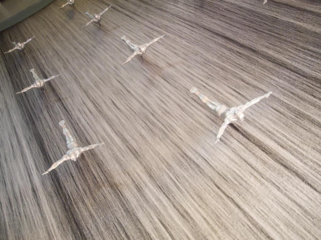
The scene is quite busy. The yellow color is not really useful. Not a good photograph. Basically a typical snapshot.
This photo creates focus. There is only one element in the frame. Much better. But it is kind of boring.
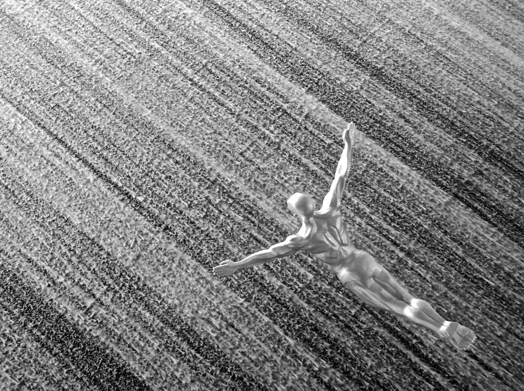
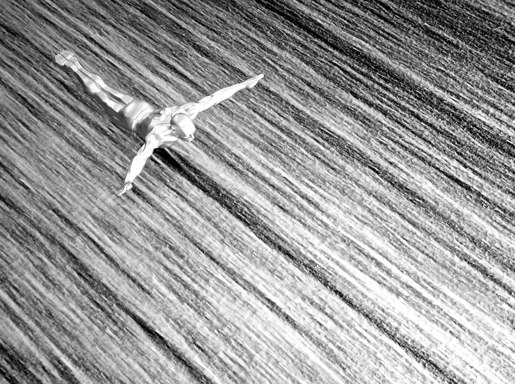
This photo is much better. It is more dynamic. Same object, different placement. What a difference!
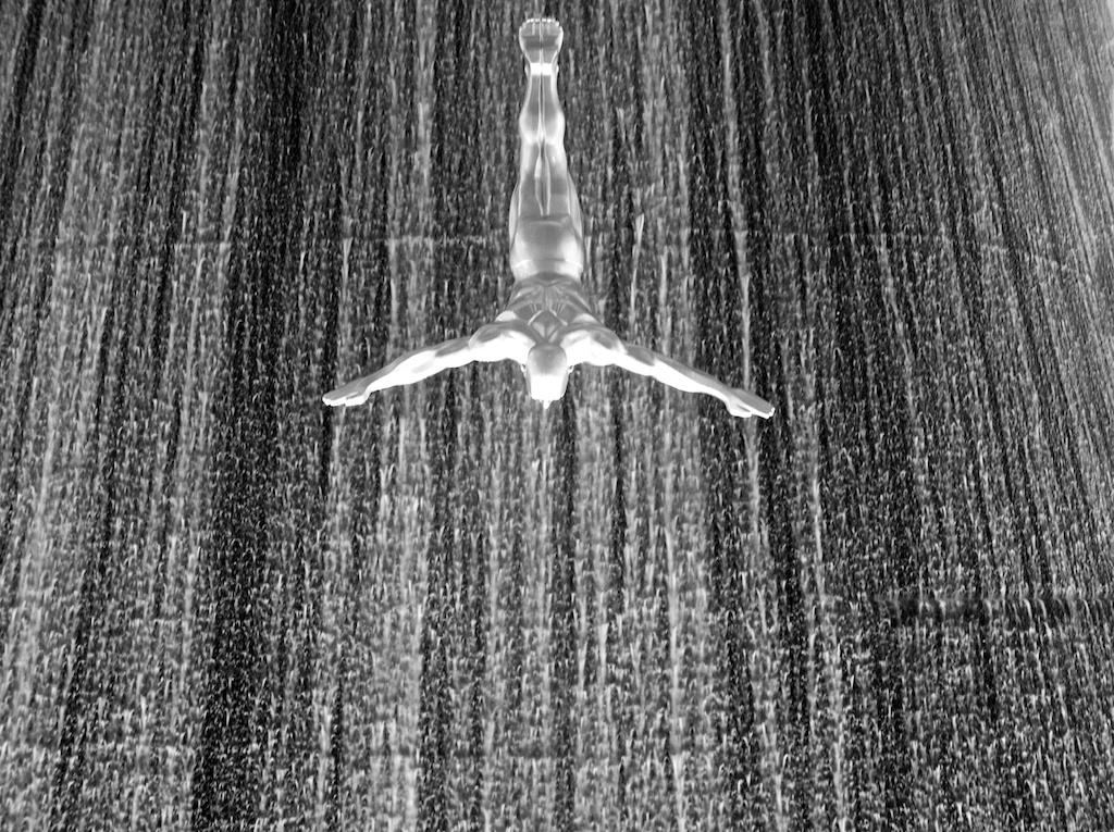
Yet another version. This photo simply works. It is dynamic and the object is placed in the right spot. Color is not needed in this case. The picture works as a black & white.
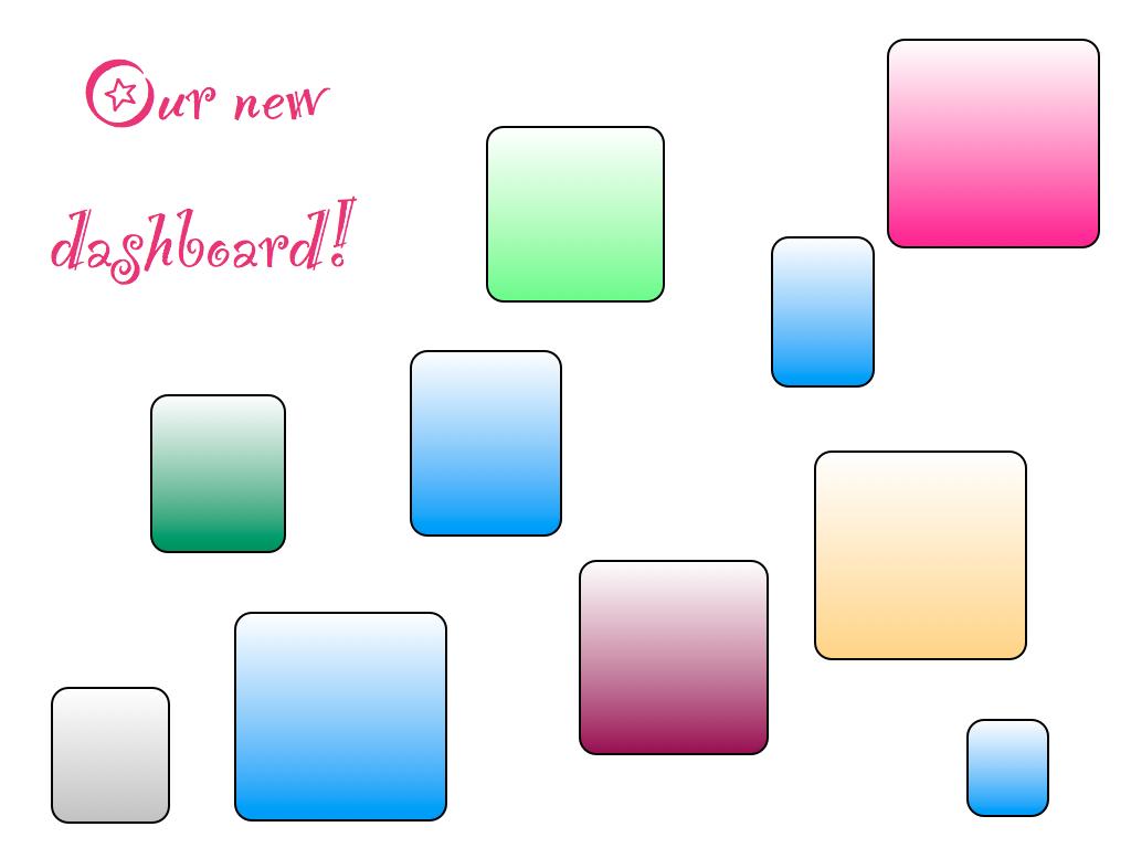
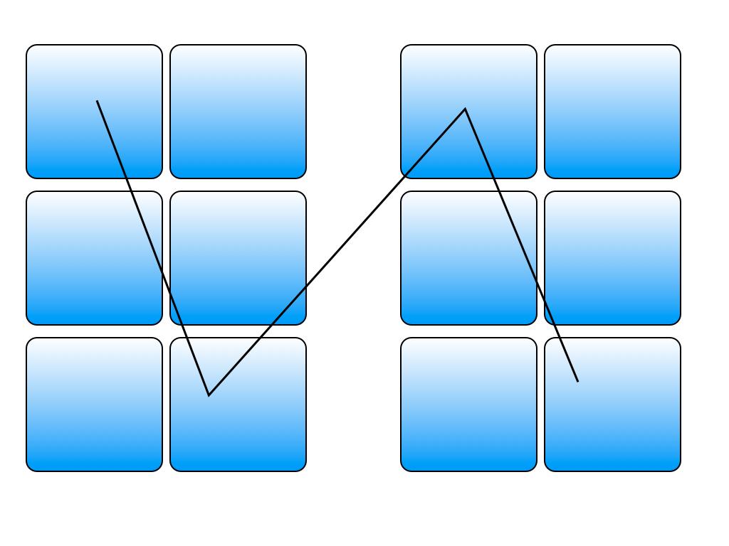
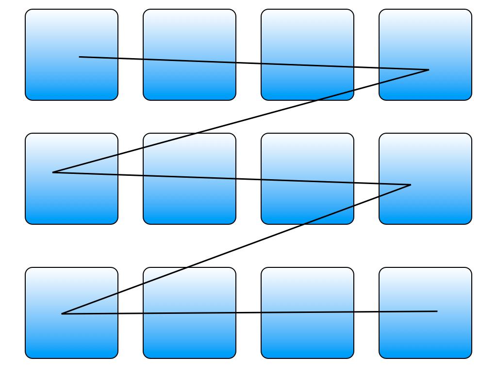
Here are some examples that highlight how these things apply to dashboard design. Consider each box as a representation of an object (chart, query, etc.). Look at the first really sloppy design attempt. Looks weird? Well, it does happen quite a bit. Take a look at this beautiful collection of crazy, busy dashboards collected and displayed by Hichert & Partner.
And now look at the following layouts below. They are simple. There is no added noise that distracts. Notice that the light blue matches the design of this blog……Notice how the careful placement of the boxes makes a difference. The lines indicate how a typical user walks through the content. Also, note how the use of color changes things.
 Next time you develop a dashboard be careful with your design. It does make a huge difference. Just these three things alone can have a big impact on the effectiveness of your dashboard.
If you are interested in this topic, please get in touch with me. We will be running some workshops about this topic across Europe in Q1 & Q2. Also, I will create a few additional posts about enhancing your dashboards with great charts over the next few weeks. Make sure to come back here!
“What you communicate depends both on the blocks you select and on the ways you arrange them”,
Freeman Patterson, Master Photographer

Comments
One response to “What photography taught me about dashboards”