Presentation advice
A friend recently challenged me to provide him with my number one tip for improving his presentations. He was looking for that famous ‘low-hanging fruit’ that wouldn’t require too much effort and energy. I didn’t have to think long and hard about that question. In my past job role, I attended many conferences and sat through hundreds of presentations. Unfortunately, a majority of the presentations did not reach their full potential. It wasn’t the content. The speakers were ok in many cases. It was the slides that lowered the impact of those speeches.
Death to Bullets
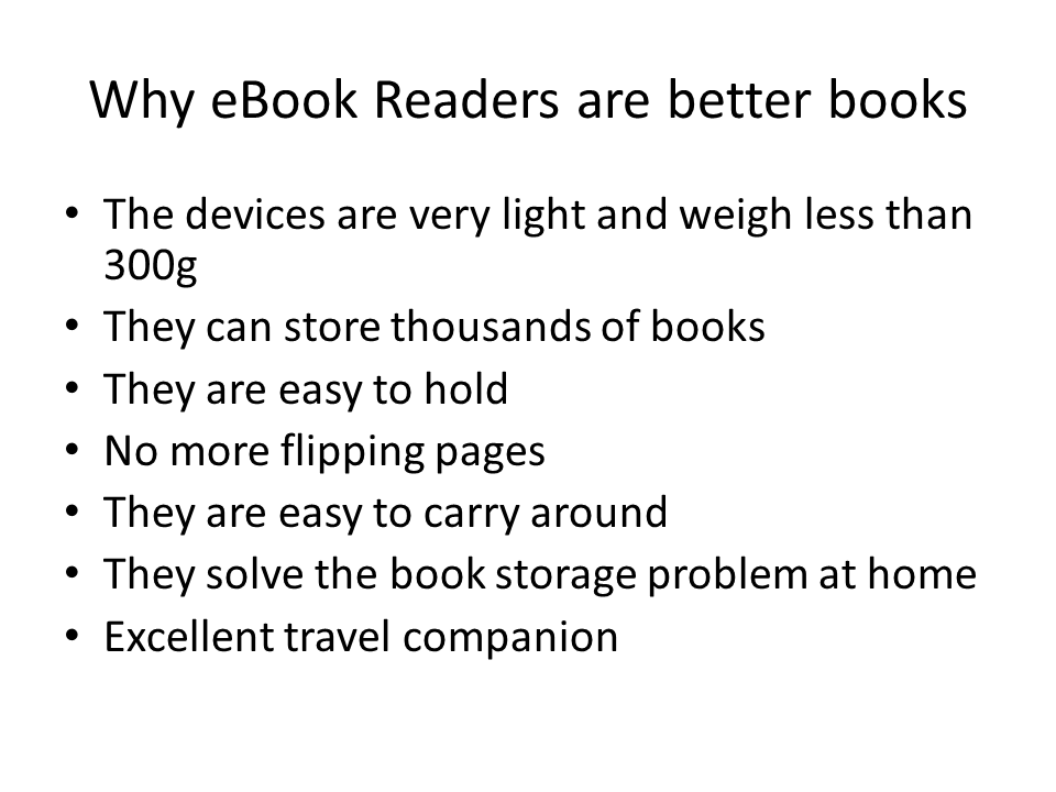
Around 75% of all the slides you and I get to absorb everyday contain tons of text. Take a look at the example below. And trust me, this is a gentle case.

There is a huge problem with this type of slide design: The minute you bring it up on the screen, people will start reading. You immediately loose the attention of your audience. The more words on the screen, the longer the attention gap. It’s a natural human reaction to be drawn to the text. There is nothing you can do. I have seen really good and charismatic speakers struggle to hold the attention of their audience with these type of Powerpoints. And it get’s worse. Once you have read the text, you tend to drift off. Hey….you know the content anyway. Let’s face it – listening is for longer periods of time is hard. Your brain is constantly searching for an easy escape. Don’t believe me? Observe yourself next time you attend a presentation.
The alternative
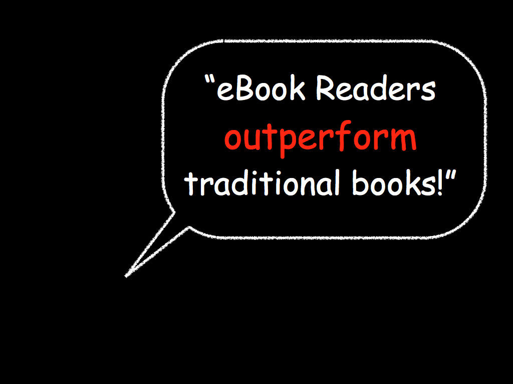
There is the famous saying: A picture says more than a thousand words. It’s true. Instead of sticking lot’s of text on your slides, try to simplify. Reduce the text. You can try something really simple like this:

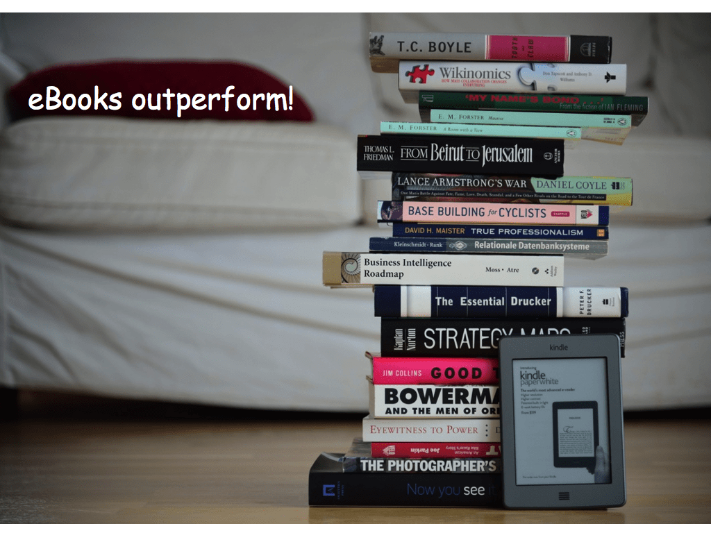
Or even better – use a simple picture. I am talking about tasteful photographs or graphics. But stay away from cheap cliparts.

Why is this a better approach? There are several reasons why you should consider this:
- People tend to remember pictures much better than words. You can do a test….see if you can remember the last slide.
- Your audience doesn’t loose focus. You are the star. They need to listen to you to understand what the presentation is all about.
- If you use beautiful and meaningful slides, people often look forward to the next set of slides. It literally keeps them engage.
- You cannot read your slides. Reading a slide is the best way to loose the attention of your audience. Simple Powerpoints on the other hand force you to have a conversation with your audience. You sound natural and you can easily inject stories.
Easier said than done? You can purchase awesome looking stockphotos for less than a dollar today. Services like iStockphoto or Fotolia have amazing collections and their prices are very decent. Even better: Few people know that Microsoft actually offers a huge collection of awesome pictures on their Powerpoint website – for free. Check it out.
Drop those bullets
Want to improve your presentations? Drop your bullets then and develop simple slides. It’s not that difficult.
If you want some advice about how build beautiful slides that have an impact, I highly recommend the following two books:
slide:ology by Nancy Duarte – This book is probably the best one about presentation design. It’s gorgeous and there are lot’s of amazing ideas for designing awesome presentations. This is not necessarily a book that you read from the first page to the last. It’s rather an amazing compendium. I use it when I’m stuck and I need some creative ideas.
Presentation Zen Design by Garr Reynolds – Excellent advice about designing slides. This book is concise and provides the basics for proper and elegant presentation design.


Comments
One response to “How to improve your presentations – a simple lesson”