Selecting dashboard colors
Last week, I wrote about the role of colors in photographs. A lot of the insights apply to the design of solid management dashboards and reports. Color choice does make a huge difference. So, let’s apply the ideas from the prior post and apply them to your performance dashboards, charts and reports:
Lesson 1 – Do we need colour?
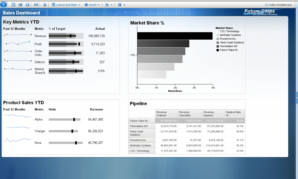
Colors are nice. But do we really need them all the time? Many photographs are even more powerful in black and white. The lack of colors helps with accentuating the important things. Why not apply this to our dashboards and reports? Take a look at the example below. It works quite well without colors. (Keep in mind that color blind people would prefer this version.)

Lesson 2 – Avoid unintended messaging
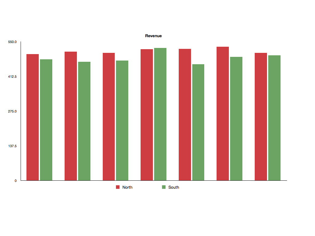
Colors do send a signal. Red, for example, indicates something powerful or a potential danger. However, too many dashboards are designed without this basic idea in mind. Colors are often applied carelessly. Take a look at the example below. I showed this basic chart to several controllers. Guess what they said: “Something must be wrong with the Northern region.” The red bars seem to indicate that there is something wrong here (red). And wait…there is also some good news (green).

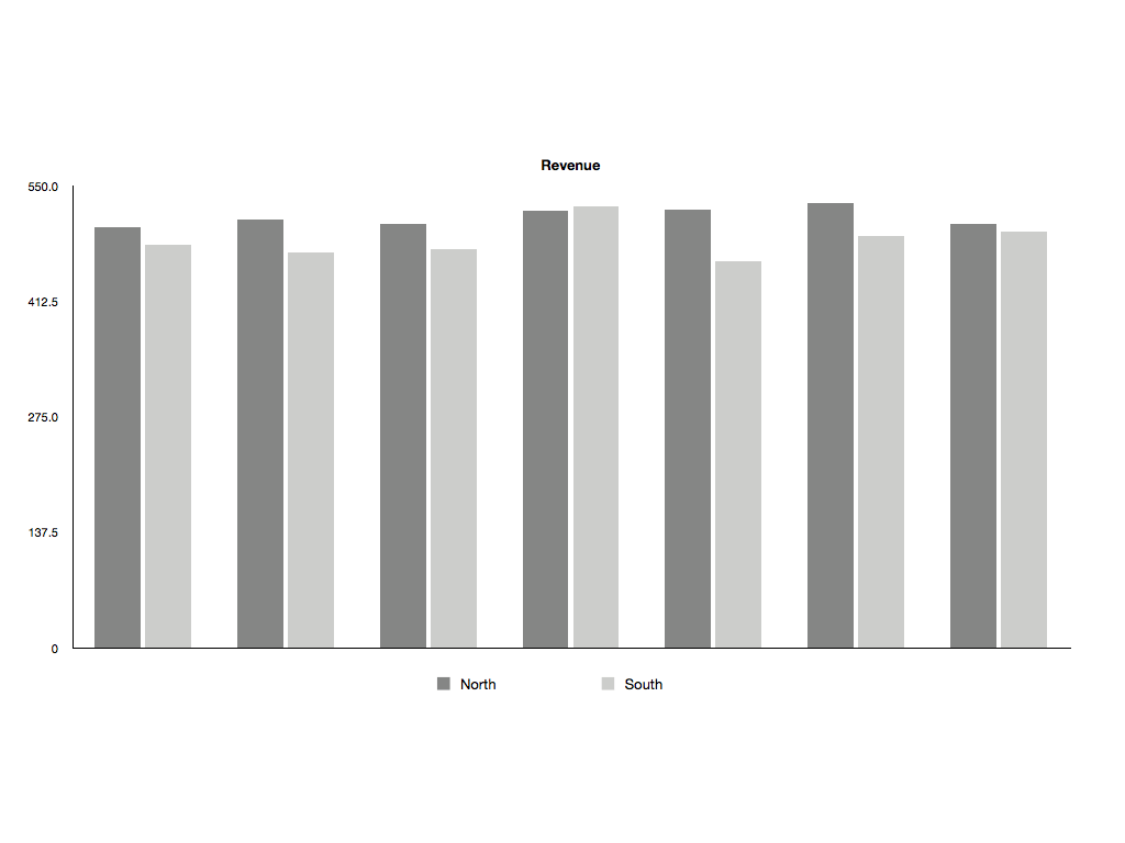
If we apply lesson 1, we get the following chart. The new version is a lot easier to digest and it does not send signals that it shouldn’t.

So, make sure to use colors with the right intent. Reserve colors like red, green and yellow to indicate important items.
LESSON 3 – USE PALETTES
A dashboard or a report should be pleasing to the eye. People don’t like working with ugly things. Design matters. If you want to use colors, think about using pre-configured color palettes. Most BI packages have a bunch of pre-configured options (heck…we can even use the super-ugly Excel 97 scheme). That is usually better than creating your own color scheme. You might want to stay away from some of the brighter options. These are quite distracting.

LESSON 4 – AVOID SENSORY OVERLOAD
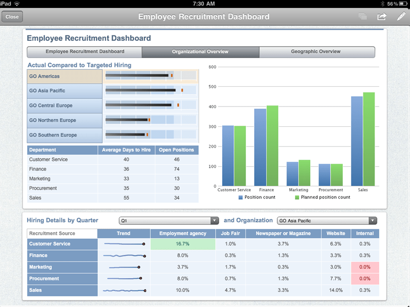
Too much color is not good. Look at this simple example below. Everything is color-coded. This is too much. I personally find it very hard to look at these types of tables.
We can reduce the colors to deliver a better experience. Let’s just highlight those items that require our attention. Much better, huh? Keep in mind – this is just a simple example. Imagine a larger color-explosion dashboard. Not pretty. When designing a report or dashboard we should think about the rule ‘Less is more’.
LESSON 5 – People do like colors
Much has been written about the use of colors in dashboards. Many people argue that the simple black and white approach is the most effective one (see the example above). I personally like that style as it helps me focus on the content. However, experience has shown that inexperienced business users do not necessarily go for that style. I have worked with various executives who demanded ‘something more colorful’. From a change management perspective, I am therefore no longer opposed to using color carefully in those cases. But that does not mean we should go crazy. Over time, people typically learn to appreciate the simpler style.
Your reports and dashboards
Pay attention to colors! It makes a big difference. It’s not all that difficult.So, why don’t you look at some of your reports and dashboard today. Assess whether the color choices are good. Have fun!


Comments
One response to “5 lessons for using dashboard colors appropriately – Part 2”