Dashboard Design
When I watch interviews with international sports stars, I sometimes have to laugh. Every inch of their clothing is plastered with logos from sponsors. It’s usually impossible to see or remember even a single one of them amidst this smorgasbord. We can spot a similar overload problem in many dashboards and reports. Corporate logos and stock photographs are injected to “enhance” the visual appearance of the objects. This is bad enough but some pictures are worse than others. Two weeks ago I saw an example of that. Several reports and dashboards featured photos of beautiful eyes. It was supposed to be a metaphor for business insight. Such a shame – it simply did not work.
Focal Point: Eyes
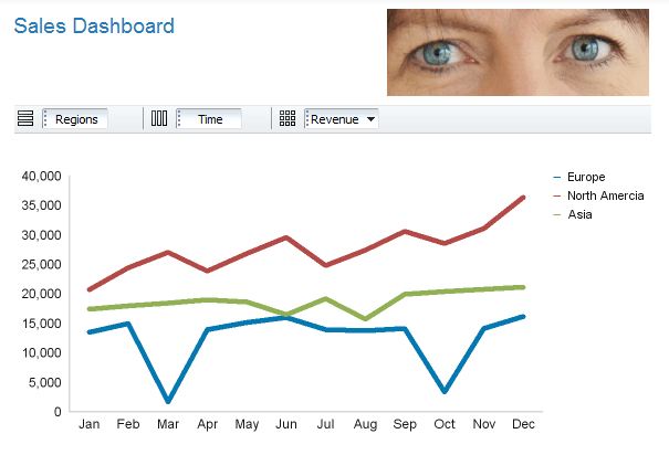
Decoration hardly ever motivates people to effectively consume information. On the contrary, photos and logos usually steals attention and waste valuable space. And human eyes are especially ill-suited as embellishment for reports or dashboards. Here is why: Eyes demand people’s attention (this is called visual weight) and they rank before anything else when we look at a photograph, a picture or a dashboard. Our eyes automatically gravitate towards that part. It’s like a magnet – eyes attract eye contact. And that pretty much explains why we should not include photos of eyes in our dashboards or reports. Take a look at the example below.
Notice how you keep jumping back to look at the eyes. This is a simple example, of course. Imagine if this was a full-screen dashboard. Your eyes would constantly flip back and forth between content and those blue eyes. Focus is lost. Plus there is the obvious question – why do we need to include the eyes here in the first place? They do not add any value whatsoever.
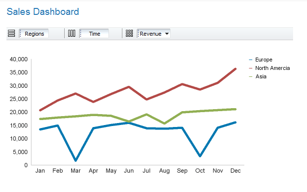
Let’s look at the better version.
 Notice the difference? You are now able to focus on the chart. There is no distraction.
A lesson for report & dashboard design
Next time you design a report or dashboard, delete those logos and photos. Most of them do not add any value, anyway. The objective of proper report and dashboard design is to deliver information in the best possible way. Human eyes represent one of the biggest possible distractions. Images of eyes clearly have no space in report and dashboard design. Hence my advice for the day: Avoid eye contact at all cost!
