It’s that time of the year. Millions of kids are excited about hunting for Easter Eggs. Why not do the same here on the blog? Below are three charts. All of them are colored according to the season. But there are some problems with each one of the charts. Can spot them? Scroll down to see some comments….
Chart 1 – The Lollipop of Products
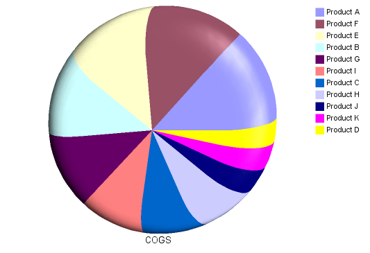
Chart 2 – The Pyramid of Deception
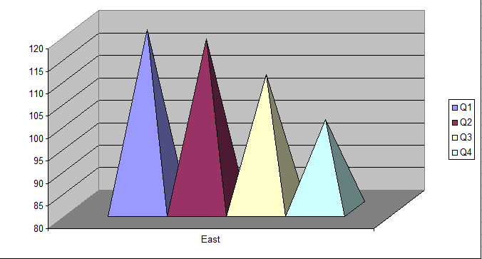
Chart 3 – Walk that line
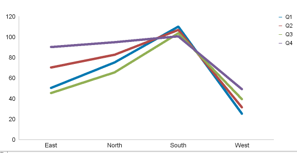
Chart 1 – Comments
Pie charts are notoriously ill-suited for displaying more than 2-3 different parameters. Notice how difficult it is to understand that lollipop chart. A bunch of products have similar COGS. The chart not only hurts your eyes, but it is unusable. Here is a different option.
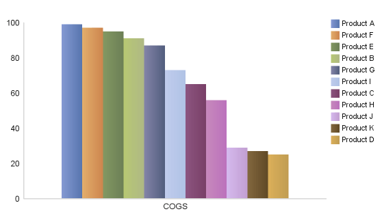
Chart 2 – Comments
I am not a fan of 3D charts. Using a pyramid chart is like adding insult to injury. Not sure that I will ever understand why one would use a pyramid type shape to visualize data. Anyway….The chart further gives the impression that Q4 revenue has dropped by 50%. The y-axis starts at 80 instead of 0. This is a big mistake as our brain compares the relative sizes of the objects. Here is the better version.
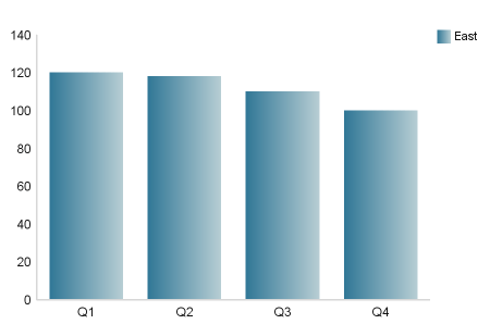
Chart 3 – Comments
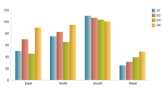
The line chart implies that the performance is terrible – it drops. Is that really so? The answer is no. Line charts provide a sense of continuity (time). We should therefore never use a line chart for values that do not belong together. But chart 3 connects different regions in a line. This is wrong. Depending on what we are trying to analyze, we could draw the following chart.
Do you have any interesting Easter Egg charts to share with the audience of this blog? Please reach out to me and submit your examples (email cp(at)sftwins.com )
