The chart aspect ratio
The other day I reviewed a dashboard. It looked great. But there was a chart on the bottom that just did not make any sense. It was way too long and stretched out. As a result, it was very difficult to use it appropriately. And that reminded me: We have to watch out for the chart aspect ratio.
The basic idea
Wikipedia defines the aspect ratio as follows: “The aspect ratio of an image describes the proportional relationship between its width and its height.” It’s as simple as that. We get confronted with the aspect ration when we purchase a TV or computer monitor or when we work with photographs. Does the aspect ratio matter? Oh, yeah it does! Take a look at the two photographs below. The first one uses the common HD 16:9 ratio. I cropped the second one down to a square format (1:1). Do you see the difference in the overall impression of the photo?


Your charts
The aspect ratio does matter for charts as well. We have to watch out for that when we create reports and dashboards or when we perform ad-hoc analysis. Not every chart aspect ratio works equally well. Take a look at the two examples below. Both of these charts have problems:


The first chart is definitely too flat – it is very difficult to analyze it. The second one is probably a bit too dense. The peaks are extremely pronounced and it would be easy to come to wrong conclusions.
A better approach
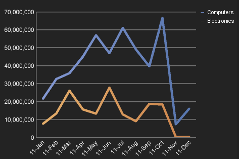
What is the idea aspect ratio then? Hard to say. It is typically a good idea to use a ratio that is wider than it is tall (2:1 or something like that). But it depends on what you want to show. From my point of view, it makes sense to experiment a little bit. I have noticed that some visualization experts have issues advice but I have found it to be very academic and hard to implement. To stick with the example from above, I did re-size the graph a bit and finally settled on this chart aspect ratio:

Your dashboards & reports
Pay attention to the chart aspect ratio. Only because there is some space left in a dashboard does not mean we can or should stick a certain graph in there. The chart aspect ratio does matter quite a bit as we have just seen in these simple examples. Also, try experimenting with different chart aspect ratios when you perform analysis. Resizing charts with personal analytics tools such as Cognos Insight is really simple.

Comments
3 responses to “Watch that chart aspect ratio!”