SCATTER CHARTS – THE BASIC IDEA
One of the interesting and really fun things to watch is young kids learning about cause and effect. They pull on a string and music starts playing. They giggle. They push a car and the car begins to roll. And so we learn to be curious at an early age and we learn to look for cause and effect relationships. And this an especially useful skill to have in business. The discovery of relationships can help us make better decisions: what happens to our revenue, if we increase marketing spending, what happens to our customer inquiries if we lowered the price of our top product? Answers to these questions can provide valuable insights.
WHAT IS THE RELATIONSHIP?
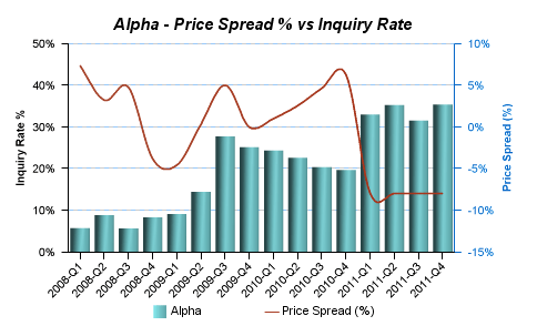
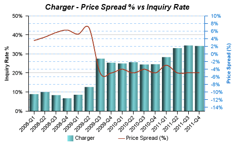
How can we go about testing and identifying these relationships? One option would be to combine two data sets in a chart. Let’s say we wanted to analyze the relationship between our price and customer inquiries. How do customers react to a price increase or decrease? We could create a combination chart for our products which outlines the price (red line) and the inquiries (green bars):


When you look at these charts it seems that there is a loose relationship between price and inquiries for Alpha but a stronger relationship for the Charger product. But it is hard to really tell. Especially for Alpha. Overall, this chart is not all that useful. We need more information.
SCATTER CHARTS
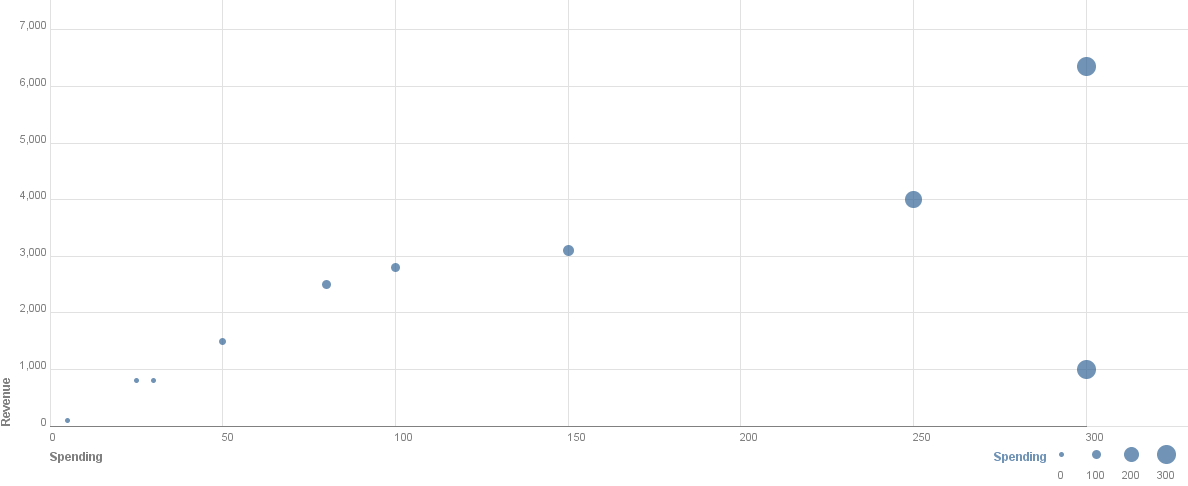
This is where scatter charts come in handy – they allow us to quickly analyze the relationship between two numeric variables. We basically take a regular Cartesian 2D coordinate system with our two numeric variables plotted on each axis. The general norm is to plot the independent variable (in this example the price) on the horizontal axis and the dependent variable on the vertical axis (customer inquiries). Here is a simple example that I created with IBM Many Eyes:

The dots represent the values for individual marketing campaigns. We mark the amount of spending on the x-axis and the resulting revenue from the campaign on the y-axis. We can easily tell that there is a relationship between marketing spending and revenue – we could almost draw a line between the dots. There is just one outlier on the bottom of the right-hand side. By the way, it is really easy to create these charts with IBM’s Many Eyes tool. Check it out when you get a chance!
PRICE AND INQUIRIES
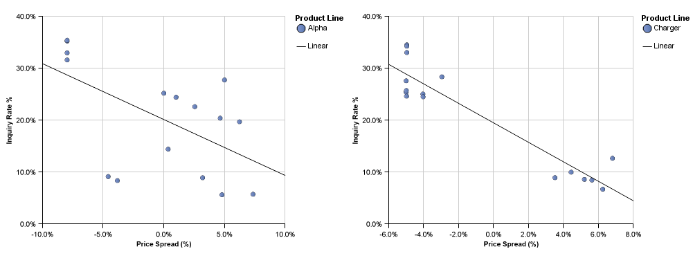
Back to the initial problem. Let’s see how price sensitive Alpha and Charger are. Let’s take a look at the resulting scatter plots. We have created these charts in Cognos 10 using the same data set. We have also included a trend line to make it easier to see a potential correlation:

Both of these graphs now tell a clear story: Alpha’s dots are literally scattered throughout the chart. There are plenty of outliers. This shows that there is just a weak correlation between price & inquiries. The picture is different for charger: The dots are more clustered and we can draw a good line, i.e. the correlation is pretty high.
SO WHAT?
Scatter charts are pretty simple to create and they do tell a good story if used for the right purpose. They are also ideal for large data volumes. However, they do ignore time. The combination charts I showed above would do a better job at that. But if we want to focus solely on the relationship, the scatter plots are better suited. Even though scatter plots are relatively easy to read, I would not recommend using them in an executive dashboard. You definitely need to know how to use them. They are probably better suited for analytical people. Also, keep in mind that while these charts help identify relationships pretty well there might still be other influence factors. But that is really common sense. So, next time you want to explore your data in a different way try scatter charts!

Comments
2 responses to “Scatter charts – Good for relationships”