SPARKLINES SPARKLE
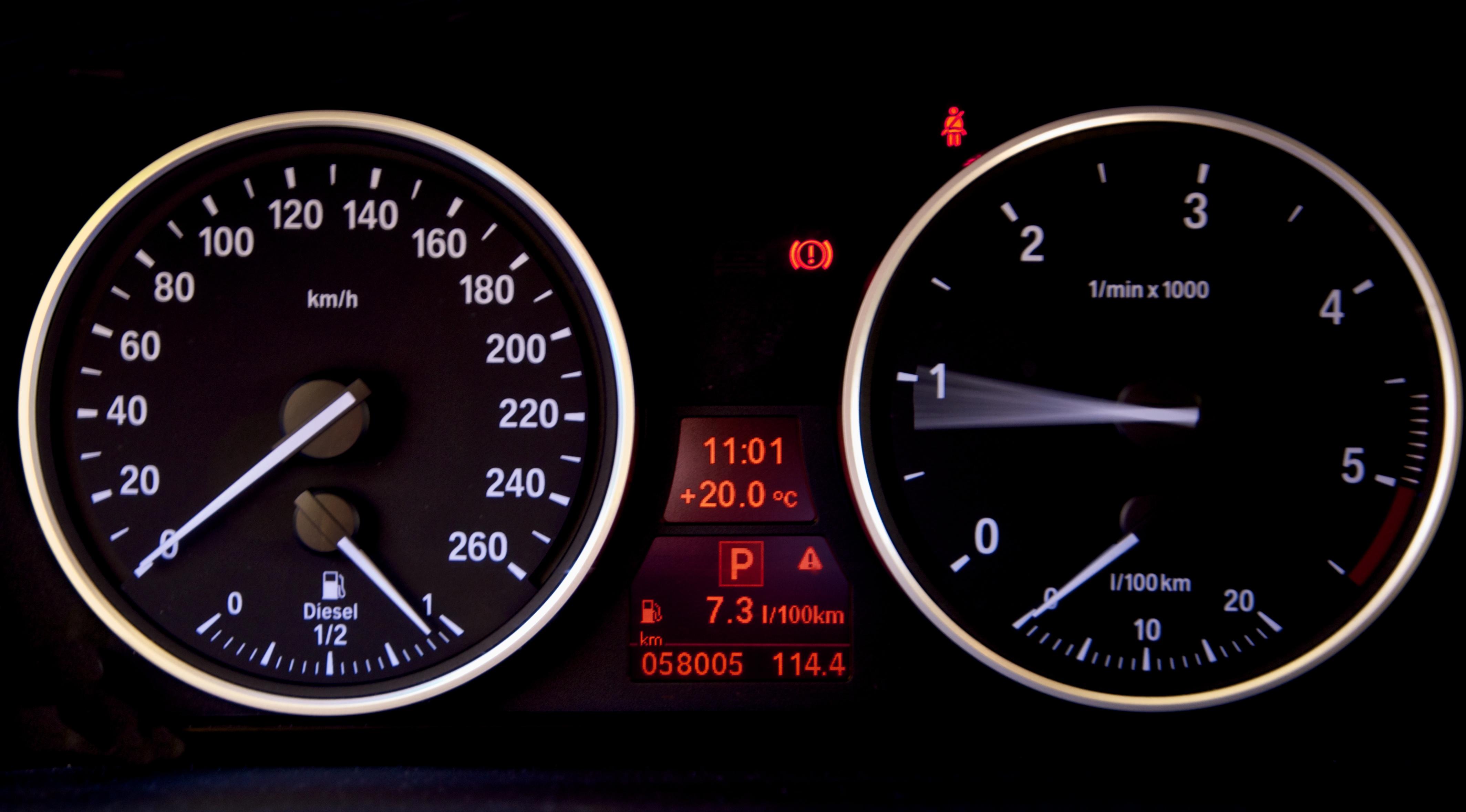
One of the key features of the dashboard in any car is the fact that it is on a ‘single page’. Car dashboards are usually very simple and it doesn’t take us more than a few seconds to familiarize ourselves in a new vehicle. Could you imagine driving a car with a complicated dashboard? Could you imagine having to scroll through multiple pages to get a speed reading while you are driving down the German Autobahn with 200 km/h? The answer is no.
THE CONSTRAINTS
Good management dashboards should be concise as well. Executives especially don’t have the time and patience to scroll through multiple pages of information. But that often creates a problem: We have a lot of information to show but there is limited space. This problem arises especially when we want to show trends. A typical dashboard might want to show profits, margins, win/loss ratios, revenue, pipeline across multiple regions. One way to display this rich set of data in a table. But tables are ineffective in quickly displaying trends. And they take up a lot of space. The other option would be to show multiple line charts. But those take up a lot of space as well.
THE SPARKLINE
Information design guru Edward Tufte developed a solution for this problem. He created a new but very simple chart called a ‘Sparkline‘. He describes them as “data-intense, design-simple, word-sized graphics”. In other words: sparkline charts are very small, yet they display vital trend data. Take a regular time series such as revenue by months. Stick that into a sparkline chart. Below is an example:

ELEMENTS
When you look at the example above, you will notice how easy it is to spot the general trend: the Conservative Party is loosing ground. You have also noticed the little dots. IBM Cognos 10 allows you to color code the low, mid and high point. (red, black, green). The Green Party is gaining. You can hover your mouse over the line to get the actual value. This type of chart simply provides the ability to obtain a quick overview of the general trend and all that within a very tiny amount of space.
SPARKLINES AT WORK
Sparklines truly show their full potential when you supplement them with metrics or other charts. Take a look the next example:

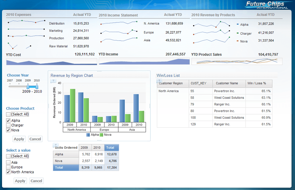
The above object allows us to review margins across regions. The sparklines quickly display the trend. The trend is supplemented with more detailed information. Notice how concise and compact the total object is. And here is an example where we can see the sparklines integrated into a regular dashboard:

The upper part allows us to quickly provide an overview of critical metrics across different dimensions.
SPACE SAVERS
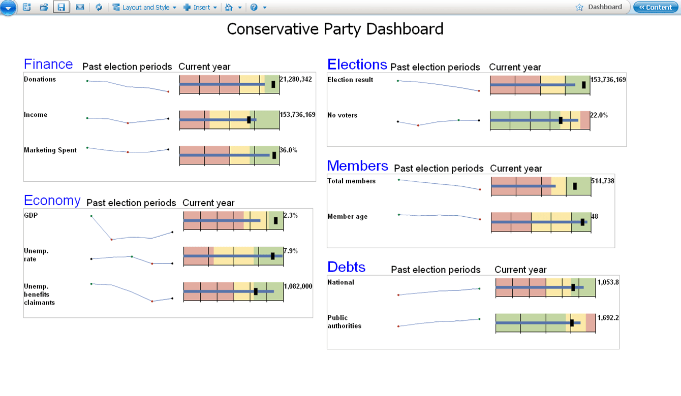
In a prior blog post I discussed the bullet chart. Those charts are also quite small and highly useful. When you combine the sparkline with the bullet chart you have a powerful combination. Notice how much information we are able to absorb (trend, actual value, current performance). A traditional line chart would take up a lot more space.

SPARKLINES – A FINAL WORD
Sparklines are great for displaying trends. This is ideal for supplementing current information (e.g. YTD Sales). They are tiny, they are easy to use and they are easy to understand. However, they will not replace a traditional line chart. Line charts are definitely a better choice when you want to perform a more detailed analysis. Next time you build a dashboard try to incorporate some sparkling charts.


Comments
2 responses to “Why sparklines sparkle in a dashboard”
Nice article,
BTW have you tried the Excel addin from Sparklines-excel.blogspot.com ?
Regards
Fabrice
Thanks for your information, i am working on cognos , after taking cognos online training @ http://www.monstercourses.com